Navigation and Focus
Focus
Focus determines where keyboard events go on the page at any given moment. For example, if you are focused on an input field of a form and begin typing, the input field receives the keyboard events and displays the text typed or pasted.
Elements that you can "tab to" are called focusable elements. This includes all form inputs, links, and buttons. They are placed into the tab order in the same sequence they appear in the HTML markup. Other elements, like <div>, <p>, or <h1> are not focusable. This is by design; for example, users are not meant to interact with an <h1>.
All focusable elements MUST have a visual focus indicator when in focus.
The Focus Ring
Focusable elements are indicated by a focus ring when they are ready to receive keyboard input. Each browser creates a colored highlighted box around the focused UI element. Never remove the focus ring from your website!
Tab to focus on this element:
You MAY Enhance the Focus Indicator
a:focus {
    outline: 2px solid #8cc63f;
    background-color: #fdf6e7;
}
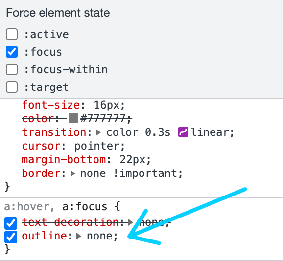
Never Remove the Focus Indicator
a:focus {
    outline: none;
}
Navigate to Sneaker Tub Website. Hit the tab key multiple times to navigate around the site. Can you tell where you are easily?
Remember, many users rely on keyboard functionality to navigate a website. So, you MUST have an indicator of where the focus is currently being held.
I inspected this website's source code and found that they did, in fact, hide the focus ring. A big accessibility mistake!
Tab Order and the DOM
The order in which you place things in the DOM (Document Object Model) determines the tab order.
Logical tabbing order
<button class="myButton">First</button>
<button class="myButton">Second</button>
<button class="myButton">Last</button>
However, CSS can affect the positioning of elements, making the tab order illogical.
Illogical tabbing order
<button class="myButton" style="float:right">First</button>
<button class="myButton">Second</button>
<button class="myButton">Last</button>
Navigation Menus
Use Lists
Use list elements to create navigation menus. This allows screen readers and other assistive technologies to announce the number of items in the menu.
- Use an unordered list
<ul>when the menu items are not in a specific order. This is the case for most website navigation. - Use an ordered list
<ol>when the sequence of the menu items is important. For example, if the menu contains a list of steps to complete.
Use <nav> Element
A navigation list SHOULD be designated with the <nav> element or role="navigation".
Identify the menu with the semantic <nav> element. This allows screen readers to access the menu directly. It is not necessary or even desirable to mark every set of links as a navigation landmark. The landmark should be reserved for the most important navigation regions on the page so that the list of landmarks does not get too cluttered.
Indicate Current Page
A navigation list SHOULD include a visible method of informing users which page within the navigation list is the currently active/visible page.
The below code adds a CSS class to the current page, so that it can be styled differently from the other navigation items.
<nav>
    <ul>
        <li><a href="#">Fruits</a></li>
        <li><a href="#">Vegetables</a></li>
        <li><a href="#">Meats</a></li>
        <li class="current-page">Dairy</li>
        <li><a href="#">Breads, Pasta, & Cereals</a></li>
        <li><a href="#">Soups & Canned Goods</a></li>
        <li><a href="#">Frozen Foods</a></li>
        <li><a href="#">Desserts</a></li>
        <li><a href="#">Snack Foods</a></li>
    </ul>
</nav>
A navigation list SHOULD include a method of informing blind users which page within the navigation list is the currently active/visible page.
The aria-current attribute indicates to screen reader users the current element, such as the visible page in a navigation list. This attribute is supported by most browser and assistive technology pairings.
<nav>
    <ul>
        <li><a href="#">Fruits</a></li>
        <li><a href="#">Vegetables</a></li>
        <li><a href="#">Meats</a></li>
        <li class="current-page"><a href="#dairy" aria-current="page">Dairy</a></li>
        <li><a href="#">Breads, Pasta, & Cereals</a></li>
        <li><a href="#">Soups & Canned Goods</a></li>
        <li><a href="#">Frozen Foods</a></li>
        <li><a href="#">Desserts</a></li>
        <li><a href="#">Snack Foods</a></li>
    </ul>
</nav>
Provide Labels
Label the menus to make them easy to find and understand. The labels should be short and descriptive. This is especially important if you have multiple menus on a single page. This can be accomplished by using the aria-label or aria-labelledby attributes.
Multiple instances of the same type of landmark SHOULD be distinguishable by different discernible names (using aria-label or arialabelledby).
This often happens when we have multiple navigation systems. One <nav> element maybe for the main menu, another may be for a utility menu. Each should be distinguishable for a screen reader.
aria-label
<nav aria-label="Main Products Menu">...</nav>
<nav aria-label="User Profile Menu">...</nav>
Provide Skip Links
A keyboard-functional "skip" link SHOULD be provided to allow keyboard users to navigate directly to the main content.
Usually, the main content of a site is not the first thing in the DOM. Keyboard users have to tab their way through a host of navigation items to get to the main text. Skips links are invisible anchors that are only reachable through the keyboard. They allow users to skip navigation elements in order to jump straight to the content of the website.
We will be creating a skip navigation link in this week's exercise.
The University of Denver, shows a “Skip to main content” link when a screen reader is being used. However, if the site does not detect a screen reader, the link is unavailable. The Madison College website has a similar functionality.

-
A skip link MUST be either visible at all times or visible on keyboard focus. During our exercise this week, we will be creating a skip link this ONLY visible on keyboard focus.
-
The skip link should appear immediately after the
<body>tag so it is the first thing a keyboard user would tab to on your page. -
Provide clear link text, such as "Skip Navigation" or "Skip to Main Content", so assistive technology knows exactly what clicking on the link does.
Links
Remember the difference between links and buttons? Links (<a>) are inherently semantic, and there is nothing special you need to do to make them accessible. However, there are some best practices to follow.
Determinable and Descriptive Link Text
A link MUST have a determinable and descriptive text so that screen readers can read something to users.
The link name (what is read to users and is shown in the accessibility tree) is calculated as follows. In order of precedence by screen readers:
aria-labelledbyaria-label- Text content between the
<a>and</a>elements (includingalttext on images) titleattribute (last resort method)
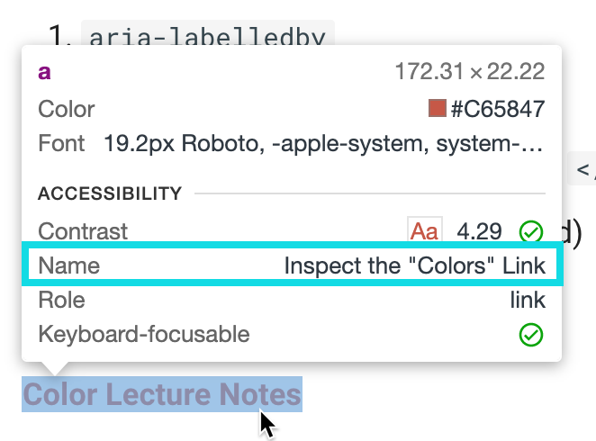
Inspect the "Colors" Link
Inspect the below link to the Colors Lecture from Unit 2 with your developer tools. Notice that it has an aria-labelledby, aria-label, text between the <a> elements, and a title attribute.
Now, navigate to the Accessibility panel in the developer tools (or look at the pop-up created when you inspect the element) and find the name of the element. Where is its name coming from?
Test the link with your screen reader. What is read back to you?
Pop-up when inspecting the "Colors" link element (below)
Developer tools accessibility panel for the "Colors" link (below)
Notice how the aria-label, text between the <a> elements and a title attribute are crossed out. The id from the heading, "Inspect the 'Colors' Link" was used instead.
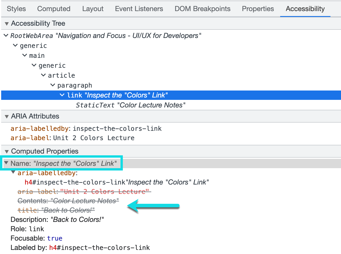
Of course, you probably would never have a link with all these attributes, but if the text between the <a> tags isn't descriptive, you can improve the name by adding an aria-labelledby. However, you SHOULD have the most descriptive text in the link itself.
Link Purpose
The purpose of the links SHOULD be able to to be determined from the link text alone.
Often we see non-descriptive text for links, like the column on the left. When possible, you should always provide descriptive text, like on the right column.
| BAD Link Text | GOOD Link Text |
|---|---|
| Click here | JavaScript curriculum for Spring of 2022 |
| Here | an article about user personas in UX design |
| Read more | Read more about ethics in Information Technology |
| More | More information about relational databases |
Be careful when you make inline text into links. Choose the most descriptive content to describe the link's purpose.
Descriptive Inline Text Link
<p>Learn more about <a href="products.html">our products</a>.</p>
Non-Descriptive Inline Text Link
<p>Learn more about our products <a href="products.html">here</a>.</p>
Links That Open a New Tab, Window, or File
A link that opens in a new window or tab SHOULD indicate that it opens in a new window or tab.
A link to an external site MAY indicate that it leads to an external site.
A link to a file or non-web format SHOULD indicate the file type
Take a look at the link below. You can tell that it opens in a new window by the familiar icon to the right of the text. How would someone who cannot see the icon know this opens in a new tab?
Inspect the above link with the developer tools to get a closer look.
The aria-describedby attribute is another method of labeling an element. However, unlike the aria-label or aria-labelleby it DOES NOT override the native element name. Instead, aria-describedby adds a description.
In the link above, I have a <span> element which is visually hidden with CSS (more on that next). The <span> content is used to describe the link.
Of course, a more straightforward approach would be just to add text to the link itself, indicating that it opens in a new tab (see below link). However, sometimes this isn't always possible or practical.
HTML Language Code Reference (opens in new tab)
Think About the User Experience
When making a link open in a new browser tab or winder, think carefully about whether this is even necessary. Examine the user’s context, task at hand, and next steps when deciding whether to open links to documents and external sites in the same or a new browser tab. NN/g Opening Links in New Browser Windows and Tabs
Visually Distinguishable
Links MUST be visually distinguishable from surrounding text.
As you learned from Unit 2, color alone cannot be used to distinguish links (or any information). Keeping the underline and color change on inline links is a good practice because it keeps the links easily distinguishable from the surrounding text.