Color
"I never met a color I didn't like."
— Dale Chihuly
Purpose of colors in web design
Not only do colors help make the website look more attractive, but they also help in the following ways:
-
Colors improve UX – thanks to the right color palette, the content may be more comfortable to read. The particular areas and objects gain more meaning, and they are easier to focus on.
-
Colors strengthen brand personality – the usage of colors may build a better connection with companies or product brands. Thanks to this, UI gains trust, and users feel that they are in the right place.
-
Colors help to accomplish goals – They may help creators and users to communicate in the right way. If you would like to warn someone in the app, you will use the right color (often red). Thanks to this, users will immediately understand that it is a message worth reading. On the other hand, the green color of the button may encourage the user to purchase a particular product, because it suggests that this may be a safe process.
-
Color creates a mood - There’s a large body of psychology and scientific literature that examines the impact of color on our thinking and emotions. In fact, there is an entire field called color psychology dedicated to the study of hues as a determinant of human behavior. Understanding the general influences of color on humans can help us design experiences that are better tailored to our brand, audience, and communications.
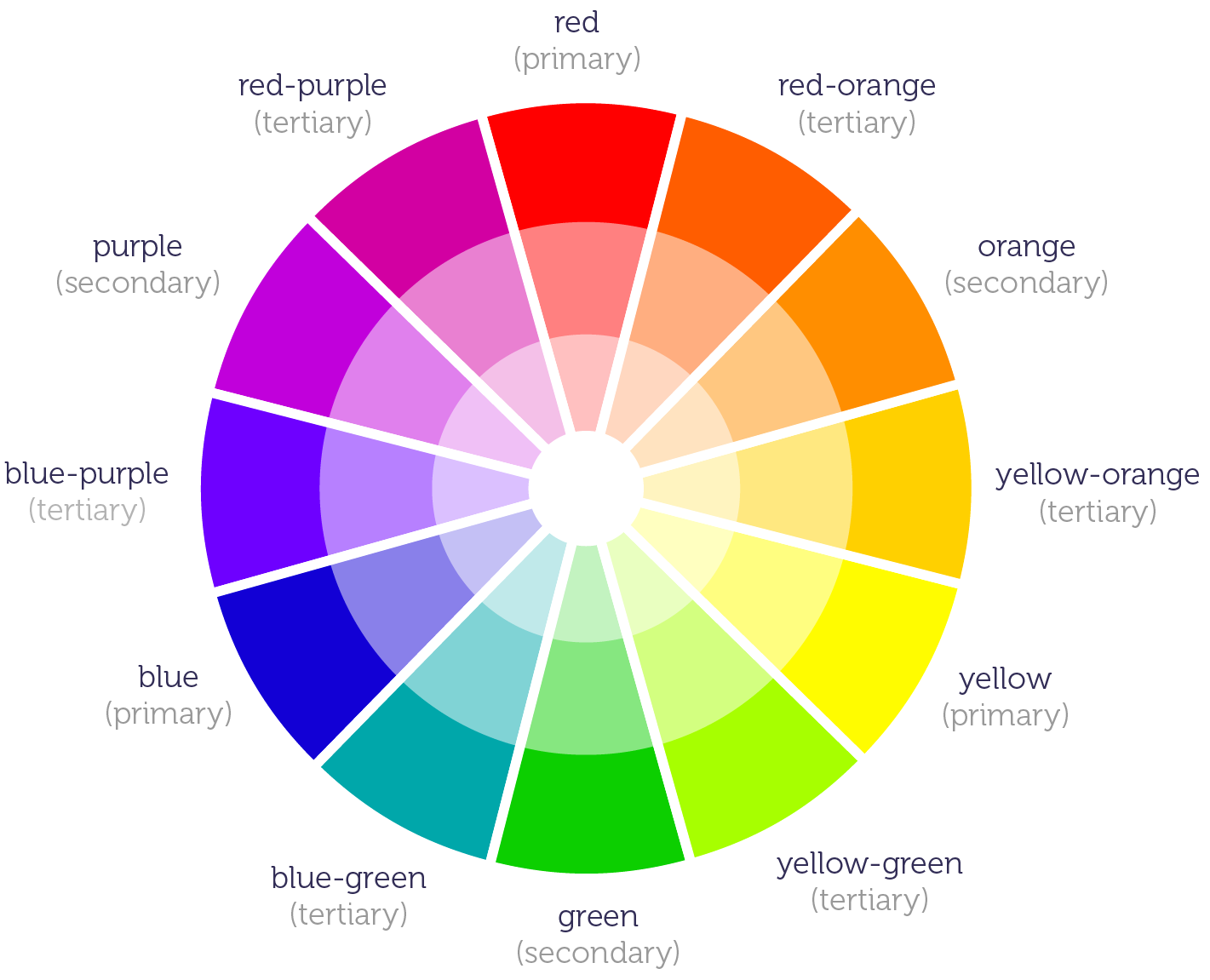
The Color Wheel
Color theory is quite a complicated subject, but a basic knowledge of the principles involved can help you use color effectively in your work.
You have all probably seen the color wheel consisting of different colors. It helps us understand how each color relates to each other and how they can be combined.
| Pigment | Definition |
|---|---|
| Primary | Colors that cannot be formed by any other colors. |
| Secondary | Colors created by combining primary colors. |
| Tertiary | Colors created by combining primary and secondary colors. |
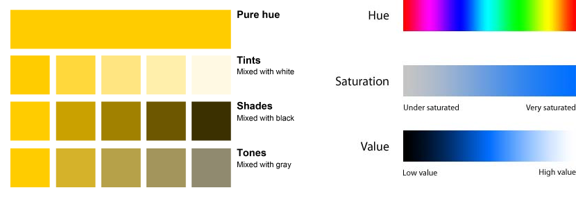
Color Vocabulary
| Term | Definition |
|---|---|
| Hue | Most basic color term and denotes an object's color. When we say "blue," "green," or "red," we're talking about hue. The hue serves as the basic color from which it can be transformed into a tint, shade, or tone. |
| Tint | Created by mixing a hue with white. |
| Shade | Created by mixing a hue with black. |
| Tone | Created by mixing a hue with both black and white (gray). |
| Value or Lightness | Measurement of the brightness of a color in terms of how close it is to white or black. The lighter the color, the higher the value, the darker the color, the lower the value. |
| Saturation or Chroma | The intensity or purity of a hue; the color of the greatest purity are those in the spectrum. It's a measurement of how different from pure gray the color is. Saturation is not a matter of light and dark, but rather how pale or strong the color is. The perceived saturation of a color can vary depending on the surroundings and lighting conditions. |
Color Models
Color has two main models: additive and subtractive.
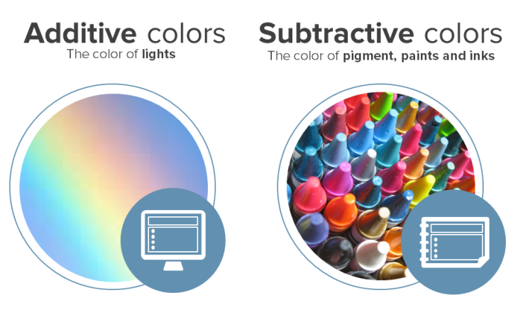
CYMK (Subtractive)
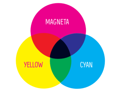
Subtractive color models use printing inks. The CYMK (four-color process) consists of cyan, magenta, yellow, and black (key). The printed ink reduces the light that would otherwise be reflected. That's why this model is called subtractive because inks' subtract' brightness from a white background. Each color is calculated in percentages – from 0 to 100%.
RGB (Additive)
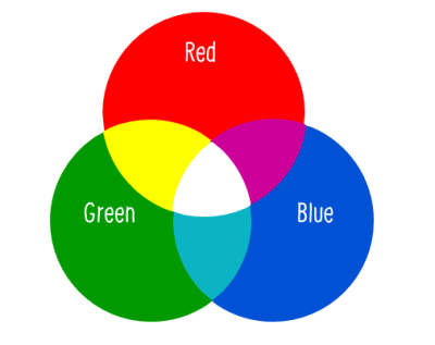
Additive color models use light to display color. RGB, red, green, and blue, are added together in various combinations to reproduce a broad spectrum of colors. The purpose is to display images in electronic systems such as television and computer screens. It is also used in digital photography.
Each of the primary colors can have a value in the range from 0 to 255. If all values are set to 0, you will produce black, where if all values are set to 255, the resulting color is white.
HSL
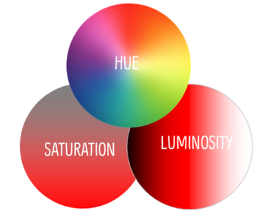
The HSL color model is a subset of the RGB model that expresses the values in terms of hue, saturation, and luminosity (or light).
Hue: The color (red, blue, or yellow). It ranges from 0 to 360, where pure red has a value of 0 or 360.
Saturation: The variation of the color depending on the lightness. It ranges from 0 to 100%, where 0 is the lightest. Another way to think of saturation, is how much gray is added. A value of 0 would be all gray and a value of 100 is pure hue.
Luminosity: The amount of white in the color. It ranges from 0 to 100%, where 0 represents black (the shade), and 100 represents white (the tint). An original hue has a luminosity value of 50.
W3Schools has a handy HSL Calculator.
HEX
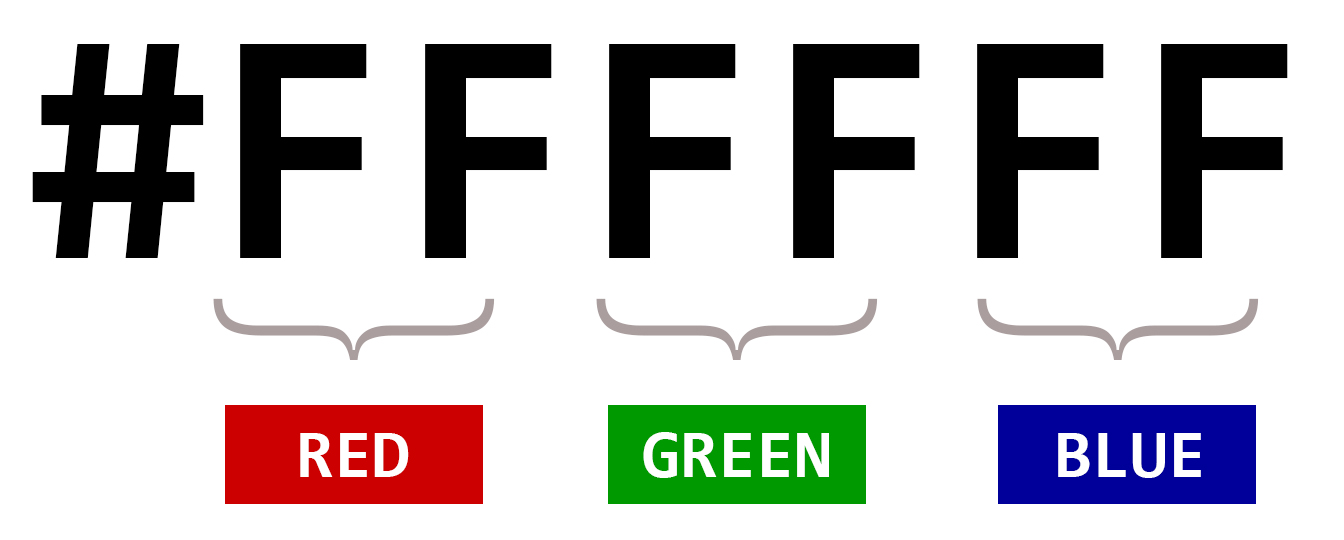
Part of the RGB model, HEX code are an alternative way of defining the combination of colors. They consist of three-byte hexadecimal numbers (meaning they consist of six digits), with each byte, or pair of characters in the Hex code, representing the intensity of red, green, and blue in the color respectively.
Hex code byte values range from 00, which is the lowest intensity of a color, to FF, which represents the highest intensity. The color white, for example, is made by mixing each of the three primary colors at their full intensity, resulting in the Hex color code of #FFFFFF.
Color Harmonies
Color harmony is about the arrangement of the colors in a design. When colors are harmonized, they can positively affect the user's experience of the product. The color balance is vital in design since users make their impression of the website or application by the first look, and colors have a significant influence on this impression.
Steps to create a color scheme
The above color harmonies are great to understand so we can build color schemes that work well and achieve the mood we are after. However, the steps to create the scheme should focus on your content, mood, and website purpose not a specific harmony.
1. Find your primary color
The primary color of your site typically comes from a company logo or branding. If this is not available, choose a color that will represent the overall mood or personality of your website.
-
Using a color picker or color generator is a great place to start to find inspiration. Or sites like Dribbble or Behance can trigger an idea.
-
Take this fun quiz!
-
Check out color psychology below or search the web for more color meanings.
2. Decide on the number of colors
Unless you're an expert in combining colors, it's better to limit the total number of colors you use in your design. A good start is with three colors. You can use tints and shades of those color, but limit the number of hues (colors) to three.
3. Pick accent color(s)
Used to bring attention to design elements. Sometimes they are complementary colors to your primary color to create the most contrast. However, they can fall into the other color harmony categories as well. It depends on the mood and amount of contrast needed on the site. Accent colors can be used for important CTAs, buttons, and hover effects.
4. Pick a neutral(s)
You can have both a dark and a light neutral color, or just one. This should be a soothing color that doesn't attract a lot of attention. It's typically used for text, outlines, borders, and large background coverage.
Building Your Color Palette
This is an excellent article outlining a process for building a color scheme. It also shows an example of how using color palette generators can go very wrong!
Thanks to Perry Govier for finding this!
Color Scheme Math!
This step by step process for creating a color scheme is easy and works well!
Applying the colors to your web design
Applying the color scheme to your design can often be the most challenging. This is where a good design system helps. Make sure each color has a purpose and is used consistently throughout your design.
Check out the The 60-30-10 Rule for some guidance on how to use colors proportionately.
This rule comes from interior design, but the principle can be applied to web design as well to achieve the right balance of colors.
60% + 30% + 10% is the proportion between the used colors:
-
60% – the amount that should belong to the primary color
-
30% – the amount for the secondary color (the image above uses two shades of gray)
-
10% – the rest of the space belongs to the accent color
Color Tips
-
Don't use a color without a purpose. Each color should have a reason to be there.
-
Be inspired by nature!
-
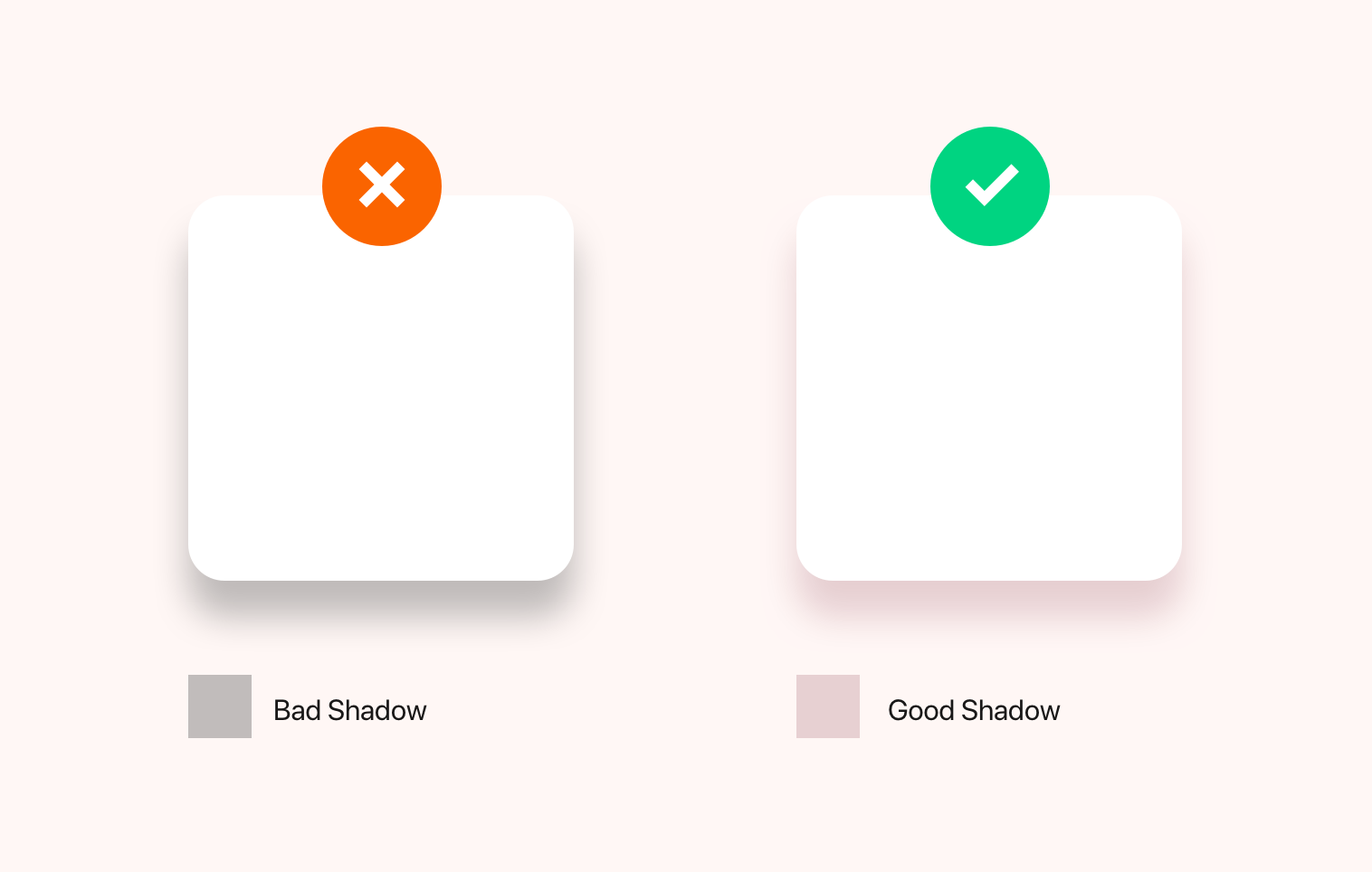
Shadows are rarely black; highlights are rarely white. Shadows in real life always have some hue base.
-
Use grayscale to test the harmony and contrast of your colors.
-
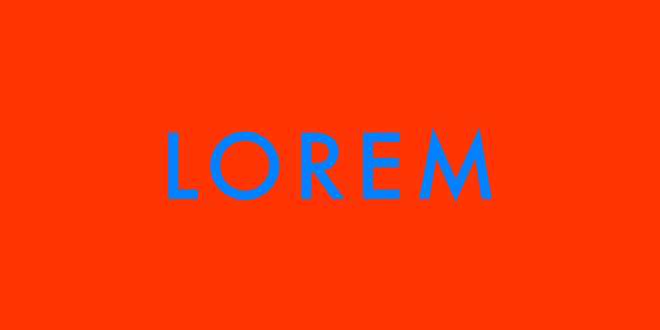
Avoid using two highly saturated colors next to each other. There are some colors that, when placed next to each other, produce a disturbing effect on our eyes. They seem to vibrate. This happens especially with colors that are opposite in the Color Wheel, and that have the same level of saturation. This can create a "vibrating" color on screens that is difficult for users to read. This visual illusion is called CHROMOSTEREOPSIS!

-
Use brilliant colors sparingly. A splash of something iridescent will draw visitors there, but if they see it everywhere, they’ll wander aimlessly.
-
Avoid pure primaries such as red, blue, and yellow. If using a primary color, it is best to use a tint, tone, or shade of that hue to lessen the saturation. Pure primary colors tend to "cheapen" a design. It can also have the undesired effect of looking childish.
-
Use muted backgrounds to make content stand out.
-
Use color sparingly; only use color to draw attention to the most important elements on the page.
Color in Culture & Psychology
Each color affects our minds differently, and knowledge of the possible reactions can help designers to communicate the right message. The effect is also dependent on the culture we experience!

Besides being cultural, color is subjective, relative, circumstantial, and recollective

Resources
Article: UX Design Colour Psychology, Theory & Accessibility