Navigation Systems
Purpose of Navigation
There are two obvious purposes of navigation:
- To help us find what we are looking for
- To tell us where we are
However, some overlooked purposes are equally important:
- To tell us what is here: the hierarchy tells us what the site contains and reveals the content to the end-user.
- To tell us how to use the site: well-designed navigation implicitly tells us where to begin and what our options are. Done well; it should provide all the instructions you need to use the site.
- To give us confidence in the company: Trusting the website we are on often determines whether we will continue using the site and if we are likely to return. Clear, well-thought-out navigation is an important first impression!
Sitemap
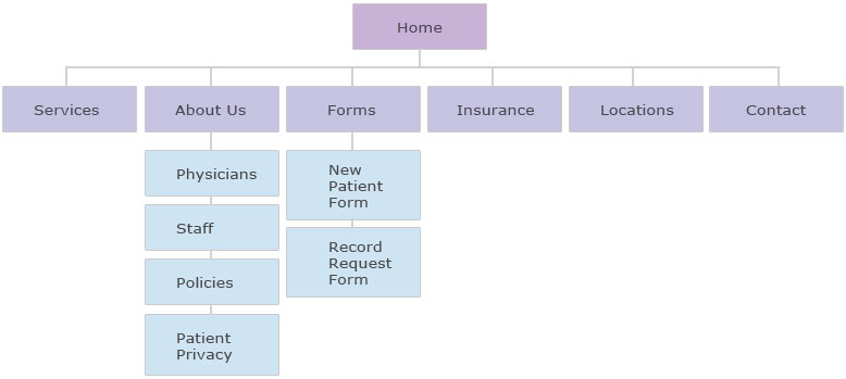
After conducting a card sort, you should know what items you need and how they will be categorized. From this, you can create a sitemap. A sitemap is a tool that outlines the hierarchy of pages within a website. It's like having a blueprint for your website. It should list all the pages on the site and how they will be organized.
Navigation Conventions
The terminology describing navigation components varies among designers. However, in all cases, the goal is to understand the role and purpose of each navigation component. Most navigation types fall into three categories: Structural, Associative, and Utility.
Structural
Structural navigation connects one page to another based on the hierarchy of the site. On any page, you'd expect to be able to move to the page above it and the pages below it. It allows users to move up and down the hierarchy of the website. Structural navigation can be divided into two types:
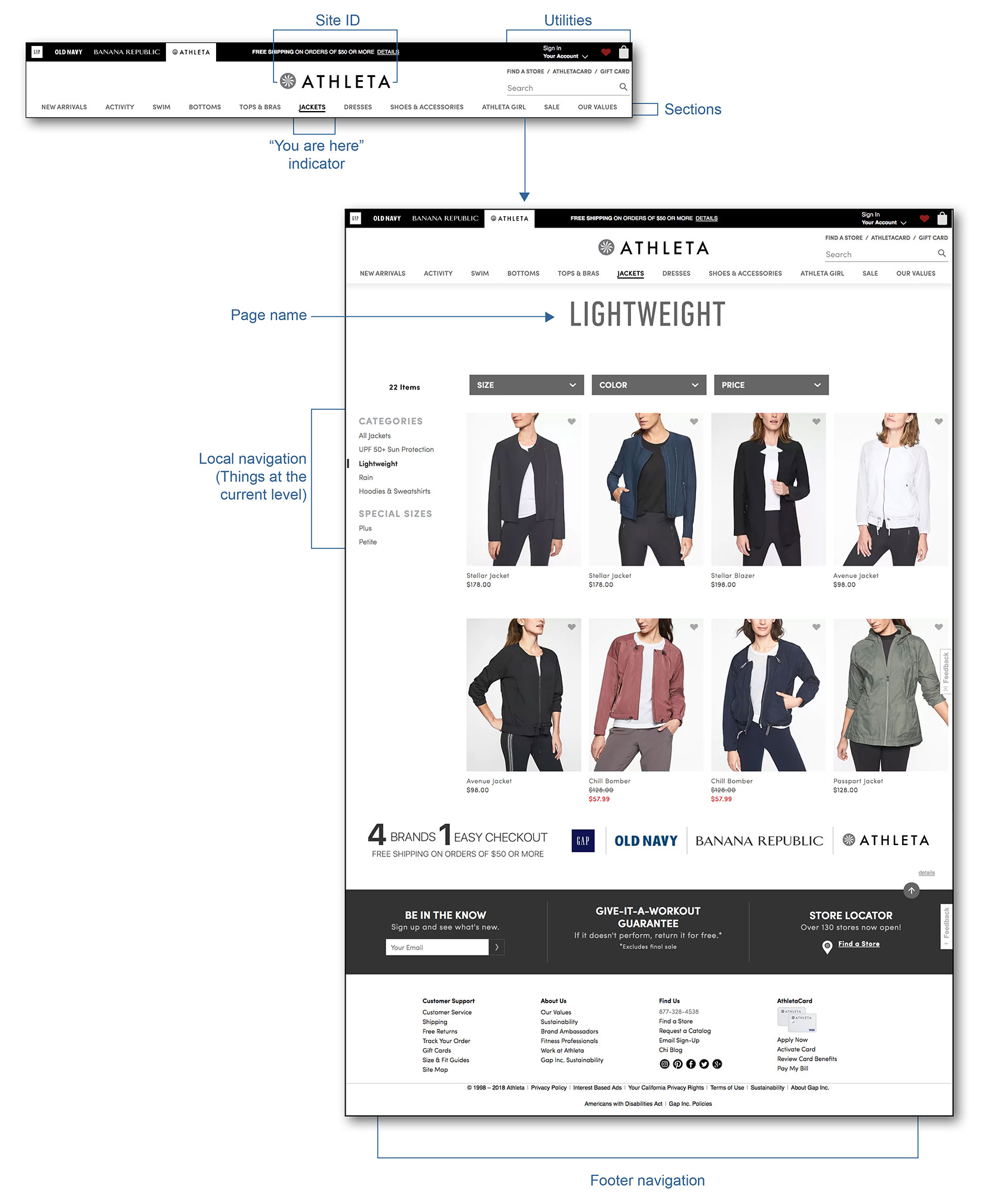
1. Main Navigation
- Also called global navigation, primary navigation
- Represents the top-level pages of a site's structure
- Expected to behave in a consistent/unchanged way
- Supports known-item seeking, exploration, and re-finding
- Answers the question, "does this site have what I'm looking for?"
- Provides comfort to the users by its persistent nature
- Allows users to switch topics/sections of the website easily
- Reminds users where they currently are on the website
- Typically includes the logo and utility navigation
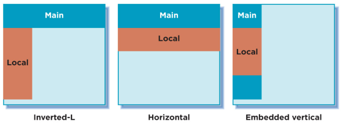
2. Local Navigation
Also called sub-navigation or page-level navigation. Used to access lower levels in the structure below the main navigation. Local navigation usually works with the main navigation and is an extension of it. Local navigation is also typically treated differently than the main navigation. It provides context about the site, including which topics belong together and related content. It also aids the user in known-item seeking and re-finding. There are three common arrangements of local navigation:
- Inverted-L placed along the left side of the website. The main navigation and the local navigation form an inverted L.
- Horizontal presented as the second row of links under the main navigation or with dropdowns.
- Embedded vertical local navigation is embedded within the main navigation in a tree-like structure.
Associative
Connects pages with similar topics and content, regardless of their location on the site; links tend to cross structural boundaries. There are three common types of associative navigation:
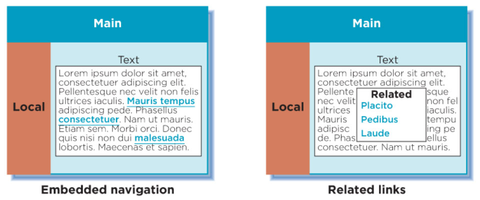
1. Embedded Navigation
- Can provide links to similar pages but often link to new content areas, different page types, or a different site altogether.
- Support exploration and may point users to new information
- Embedded: links embedded within the text
- Related links: appears at the end of some text or on the side
2. Quick Links
- Provide access to important content or areas of the site that may not be represented in the main navigation.
- Used to highlight frequently accessed content or promote areas deeper in the site
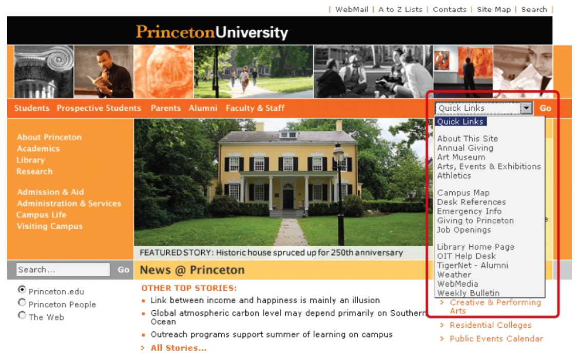
3. Footer Navigation:
- Located at the bottom of the page, usually represented by text links
- Often leads to a single page with no further levels of a structure below them
- Usually provides supplementary information not pertinent to the main topic of the site, such as copyright information, terms and conditions, and site credits.
- Doesn't address a specific user need but addresses a legal requirement for site owners
- Can be a "catch-all" for various types of content
Utility
Connects pages and features that help people use the site itself. These may lie outside the main hierarchy of the site, and their only relationship to one another is their function.
- Generally smaller than the main navigation
- Appears on the top, sides, or bottom of the page
- Often appears with the main navigation
Navigation Examples
Types of Navigation Menus
Choosing a type of navigation menu is a UI designer's job, and the type of navigation depends on the website's content. Here are four common types of menus:
1. Dropdown Menu
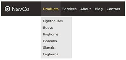
Dropdown menus are commonly used but are not always the best solution. They are a simple solution that offers a clean and tidy user interface. However, they do have some drawbacks:
- Difficult for search engines to crawl
- Users can miss essential pages that are hidden within the dropdown
- They're frustrating to use and clunky on mobile devices
- They allow too many options
- They can be temperamental
When used, the menu needs to contain enough navigation values so that the user knows how to interact with it and not so many that the user has difficulty scanning the menu list.
2. Mega Menu
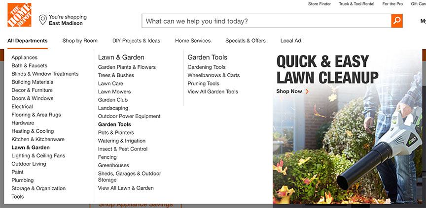
The mega menu has become a preferable solution to the basic dropdown menu. Although it behaves like a dropdown menu, it has performed well in usability studies. The number of options it offers the user makes it valuable and worth the effort it takes to use.
Mega menus are large dropdown menus that offer many layers of navigation. They allow the user to view the website's structure at a glance and easily locate what they are looking for. They should only be used when you have a lot of content on your website.
3. Hamburger Mobile Menu

Hamburger menus have become increasingly popular on websites and apps over the last few years. They are commonly used for mobile websites, making them very recognizable. Since the navigation can be hidden, allowing for more content space. The hamburger menu helps get everything tucked away, preventing users from being distracted by choices or other functionality.
However, there are some drawbacks to using a hamburger menu. It doesn't showcase features very well, and 25% of apps get deleted after their first use, suggesting that the app isn't showing its value quickly enough. Hiding the features in a hamburger menu saves space but also hides important features of an app from the user. Secondly, usability testing has shown that click rates are low when the hamburger menu is placed in the top-left corner of the screen. This location isn't often viewed as important to the user, nor is it an easy spot to reach on a mobile device.
4. Fixed Position Menu
The fixed-position menu, or sticky menu, remains visible as you scroll down the page.
- The header (menu, title, logo) remain visible as you scroll down the page
- Dropbox
- Used on websites where action is intended, such as retail and e-commerce websites
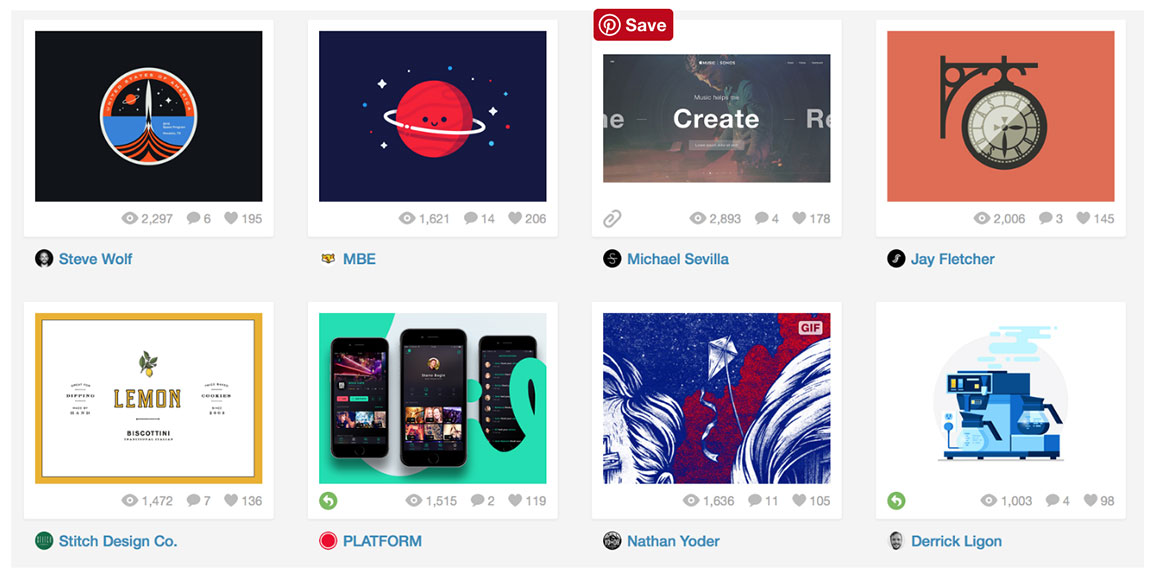
5. Card-Style Navigation
The image-sharing site Pinterest popularized Card-style navigation. Each card, which includes an image and, sometimes text, serves as entry points to more detailed information.
- Helps group and "chunk" content into logical groups
- Improves scannability for users
- Easy to digest a lot of information quickly
- Visually pleasing
- Easy to press on in mobile apps