Contrast
"Creativity is allowing yourself to make mistakes. Design is knowing which ones to keep."
— Scott Adams
Purpose of Contrast
- Draws the user's attention to the essential components of the interface
- Helps the user understand relationships between onscreen elements
- Communicates hierarchy and signifies importance within and across multiple sets of visual information
Whatever you apply the most contrast to, is where the user's attention will be drawn. If that element is not the most important thing on the screen, you're directing the user's focus in the wrong place.
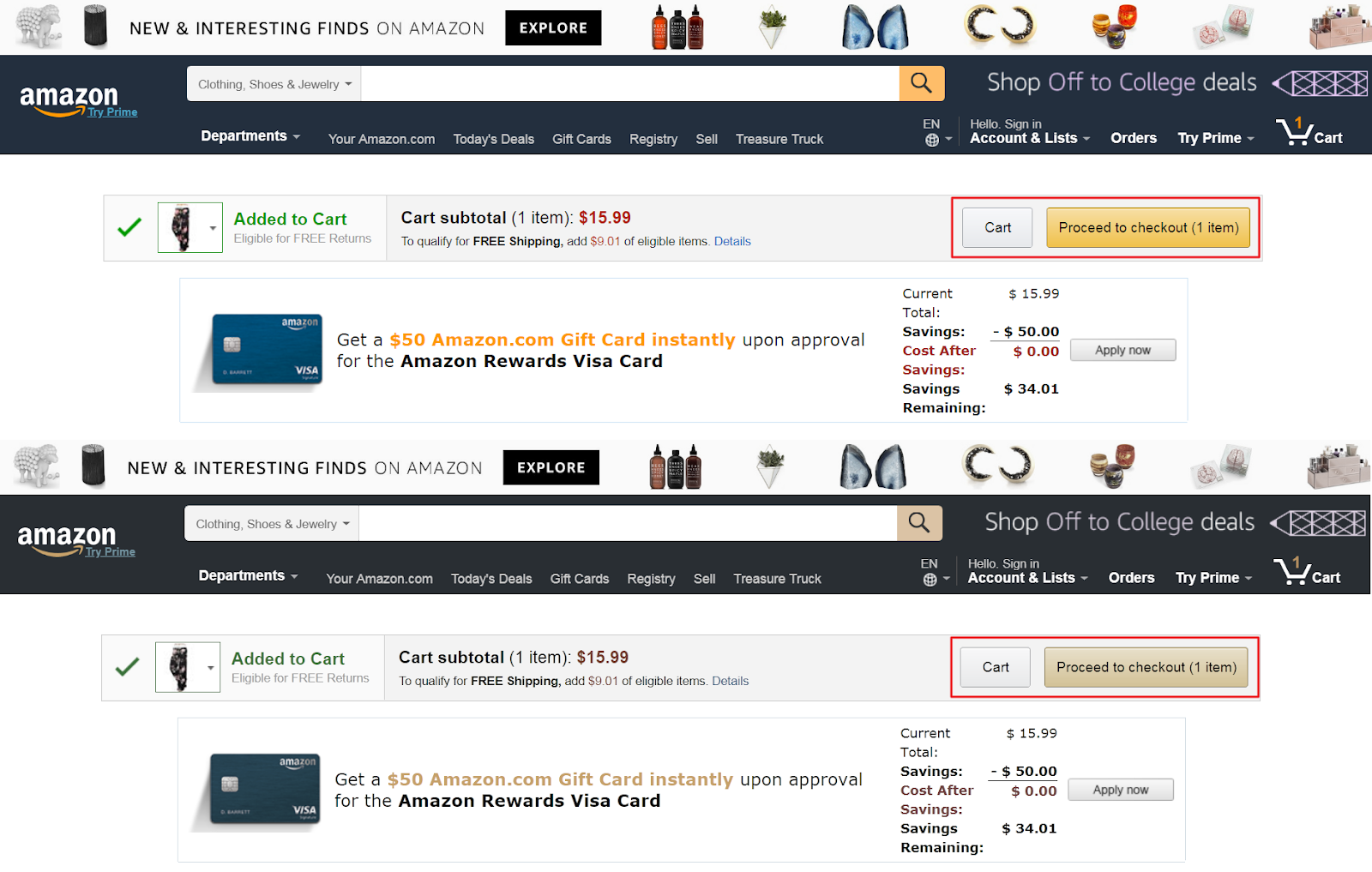
The image below has too many elements with high contrast. Although the "Learn More" button is bright green, the eye has a difficult time focusing on that element with the competing elements.
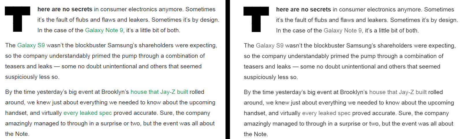
Compare the image below to the resent version of their site.

Although this image appears to have strong contrast when we change it to grayscale, we can see that each element is competing with each other.


This company has also taken steps to improve the contrast on their site.
Contrast and Accessibility
We will be discussing accessibility in greater detail in the next unit, but having the correct amount of contrast is an important requirement for WCAG (Web Content Accessibility Guidelines).
The 4.5:1 ratio is used in this provision to account for the loss in contrast that results from moderately low visual acuity, congenital or acquired color deficiencies, or the loss of contrast sensitivity that typically accompanies aging.
The contrast required is for the text and its background color so it can be easily read. There are two WCAG compliant levels, AA and AAA.
AA Contrast ratio of at least 4.5:1 between background and foreground. 3:1 for large text (over 18 point or 14 point bold)
AAA This is the highest level of compliance. Contrast ratio of at least 7:1 between background and foreground. 4.5:1 for large text (over 18 point or 14 point bold)
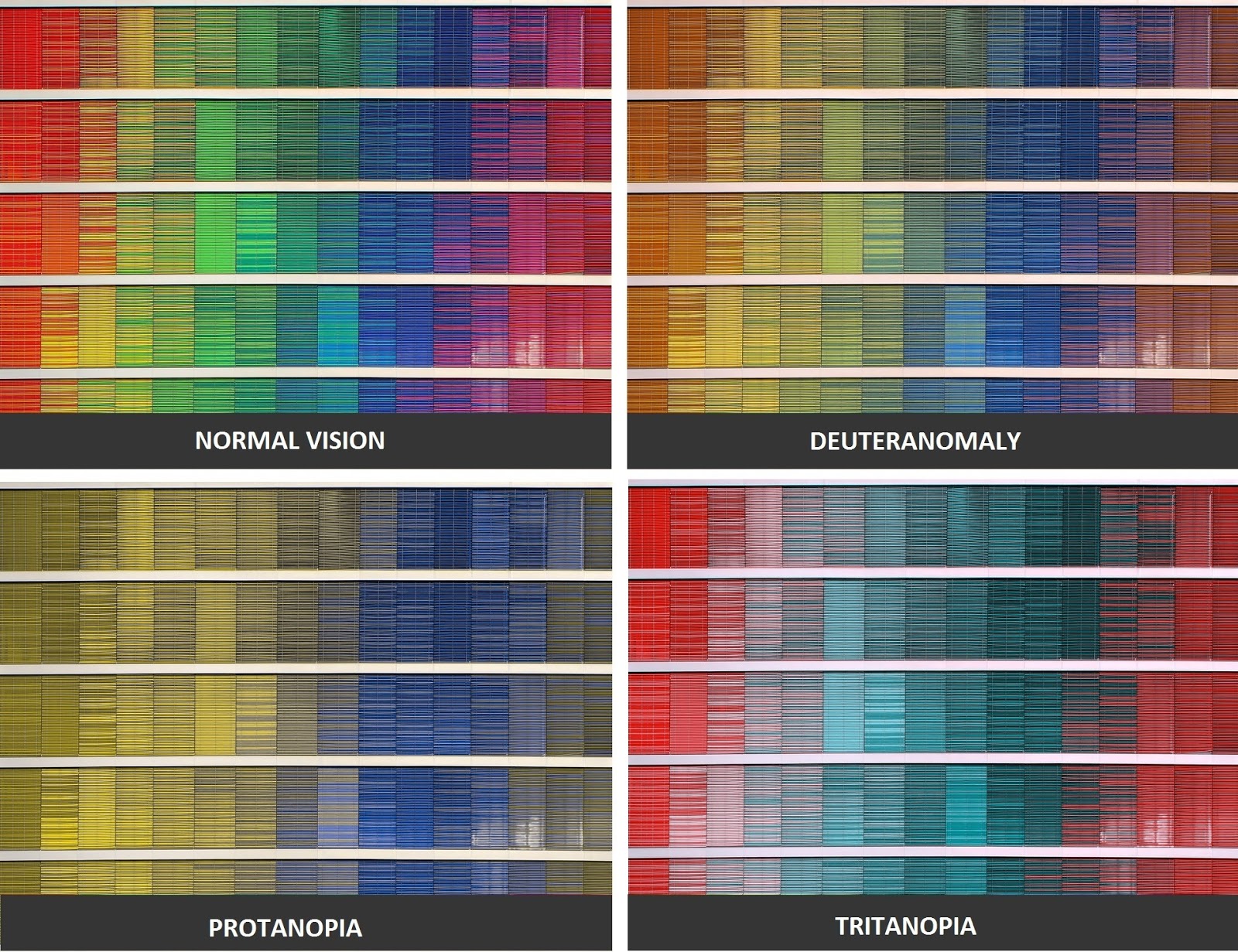
Color Blindness
It's also important to make sure your color contrast is still perceivable for users with color-blindness or are visually impaired. Different types of conditions determine which colors they have difficulty distinguishing, but red-green are the most common.
Deuteranopia This is the most common and entails a reduced sensitivity to green light.
Protanopia This is a reduced sensitivity to red light.
Tritanopia This is a reduced sensitivity to blue light, but not very common.
Achromatopsia People with this condition cannot see color at all, but it is not very common.
Ways to improve accessibility
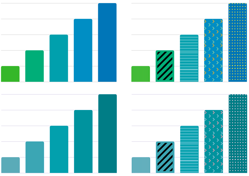
1. Use patterns and textures
Using patterns or textures in solid colors can help distinguish differences in colors that are close in hue. This is especially important with graphs or pie charts. Adding text labels also ensures comprehension.
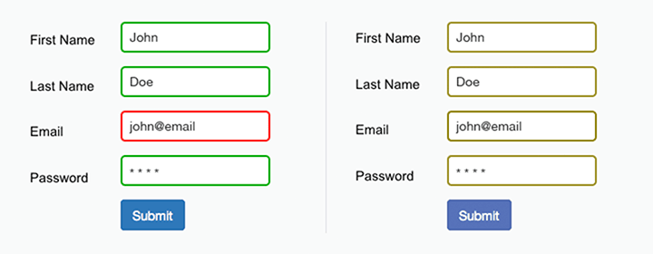
2. Use colors and symbols.
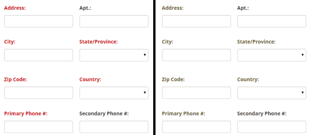
Never ONLY use color to convey information
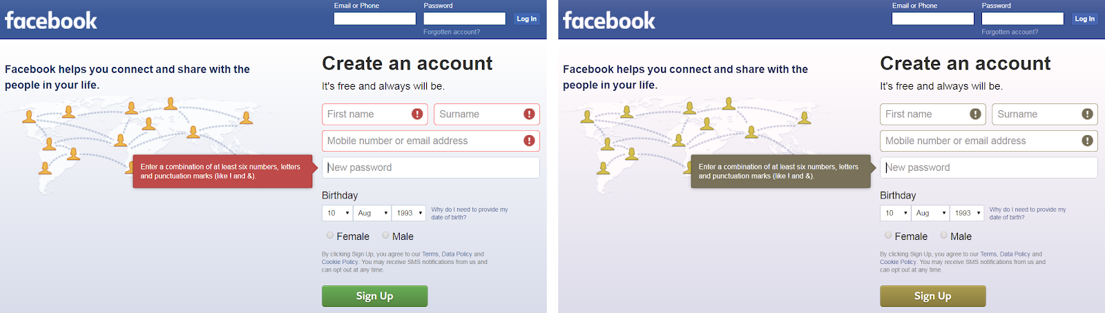
The below image shows an example of an error in the email field. However, the only indicator of the error is the red border. Colorblind users would not be able to differentiate the field borders.
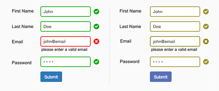
Addition of text and icons
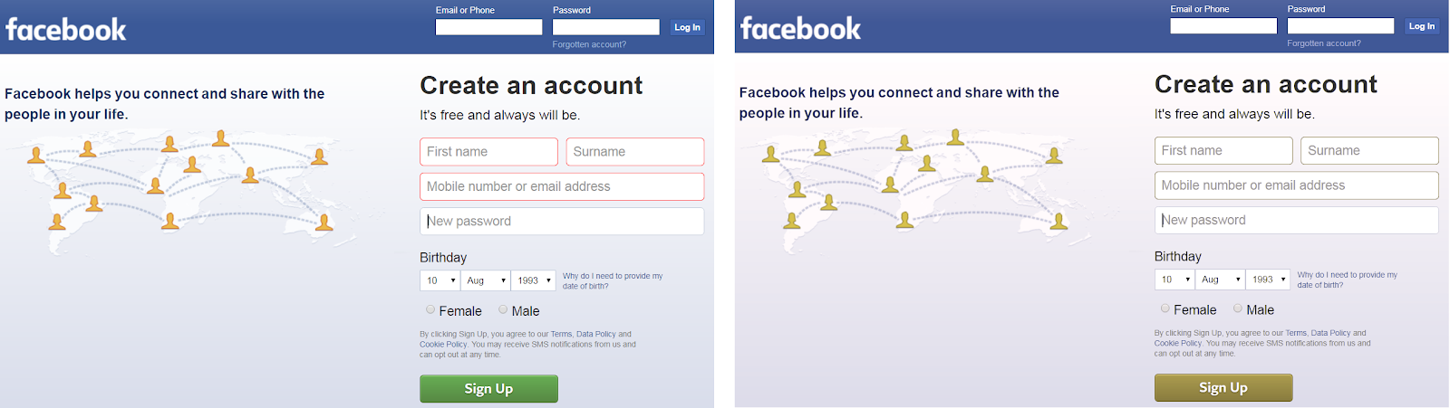
Let's take a look at Facebook's sign up form. If the form relied on color alone to let users know they had made a mistake on a particular field, it might look something like this for a red-blind (protanopia) user:
Here's a look at Facebook's sign up form with symbols and error messages attached:
3. Use text labels
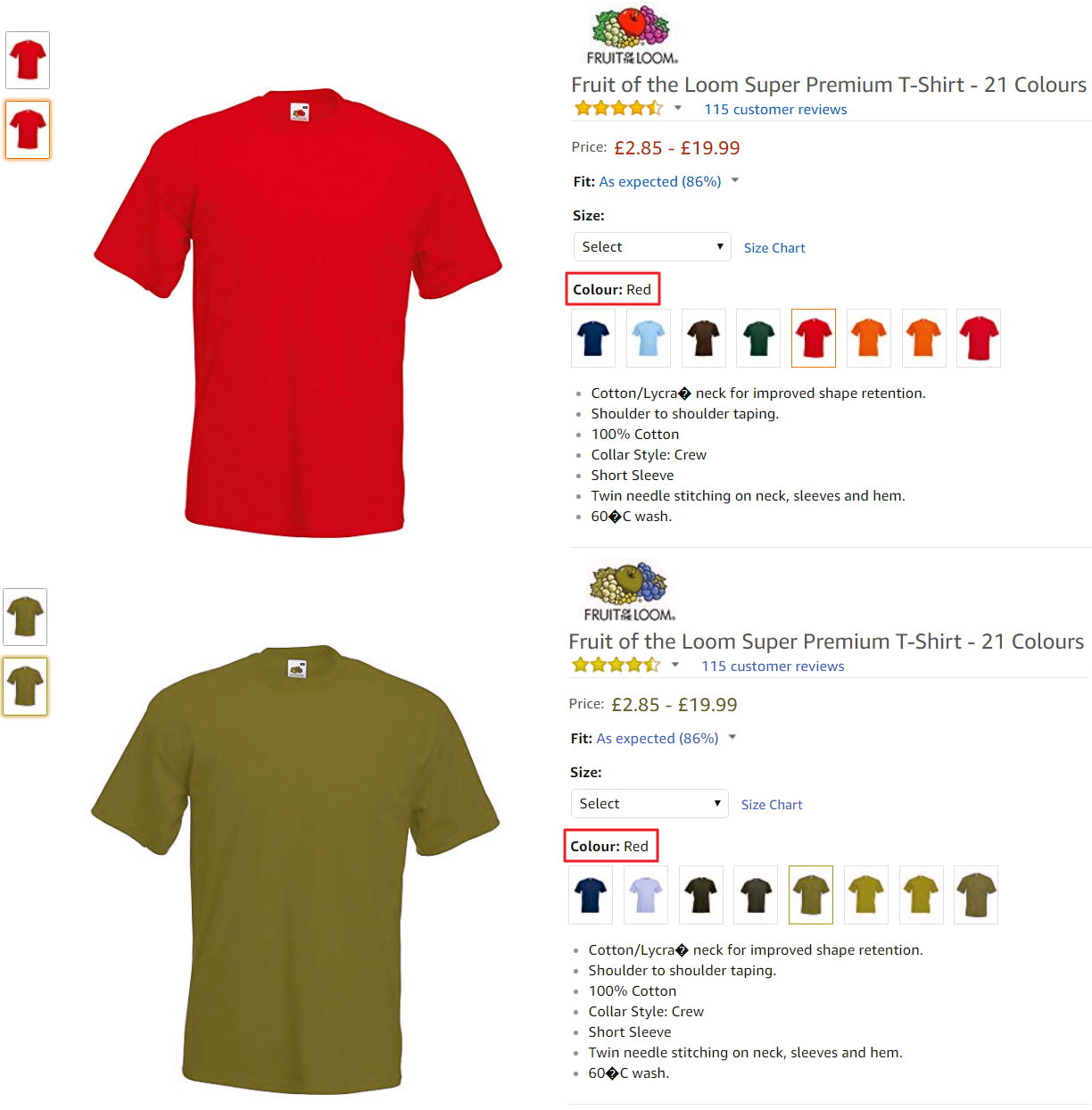
Adding text labels to color filters and swatches improve accessibility for colorblind users. Depending on the type of color blindness, users might find it difficult to differentiate between different colors (or shades) without some sort of descriptive text.
This also improves accessibility for people with normal vision. White, off-white, or light gray are hard to differentiate on monitors.
4. Underline links
A lot of the time, we use font color or font weight to denote links. While it may be possible for someone with color blindness to distinguish anchor text from regular text, it's certainly not ideal due to the low contrast ratio.
5. Color combination to avoid
There are a few color combinations to avoid because they're difficult for colorblind (and normal vision users) users:
- green-red
- green-blue
- green-brown
- green-black
- green-grey
- blue-grey
- light green-yellow
- blue-purple
6. Make CTA buttons standout
Often designers use color to make call-to-action buttons stand out. However, the color may be difficult for users to perceive.
Instead:
- Increase the size of the button.
- Experiment with different button placement.
- Increase the contrast between primary and secondary buttons.
- Use borders, icons, or font-weight to differentiate primary and secondary buttons.
7. Mark required form fields
Colorblind users may have difficulty differentiating between required and optional fields if you use color alone to denote required fields on forms.
Instead:
- Mark required fields with an asterisk.
- Label the field with the work required or optional.
- Remove optional fields from the form.