Images
"The soul never thinks without an image."
— Aristotle
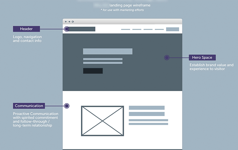
Hero Images
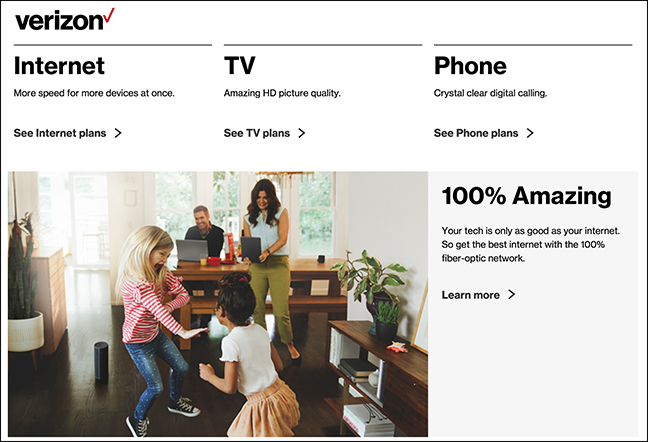
Hero images are oversized banner images that appear in the header section of a webpage. It is often the first thing users see when arriving on a website. A hero image is an effective way to communicate the brand of the website quickly (it only takes 50 milliseconds for a user to form an opinion about a website). They also don't have to be static images; they could include an interactive carousel or a background video.
Rules for choosing and using imagery
1. Make sure it serves a purpose
- Make sure you understand what the purpose is.
-
Images have a lot of emotional power.
-
Images shouldn't be visual noise.
More images != Better -
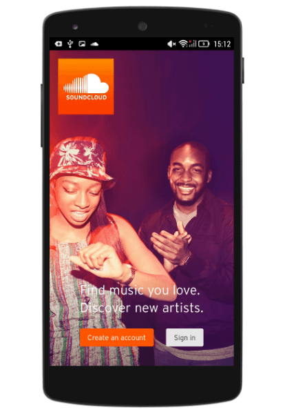
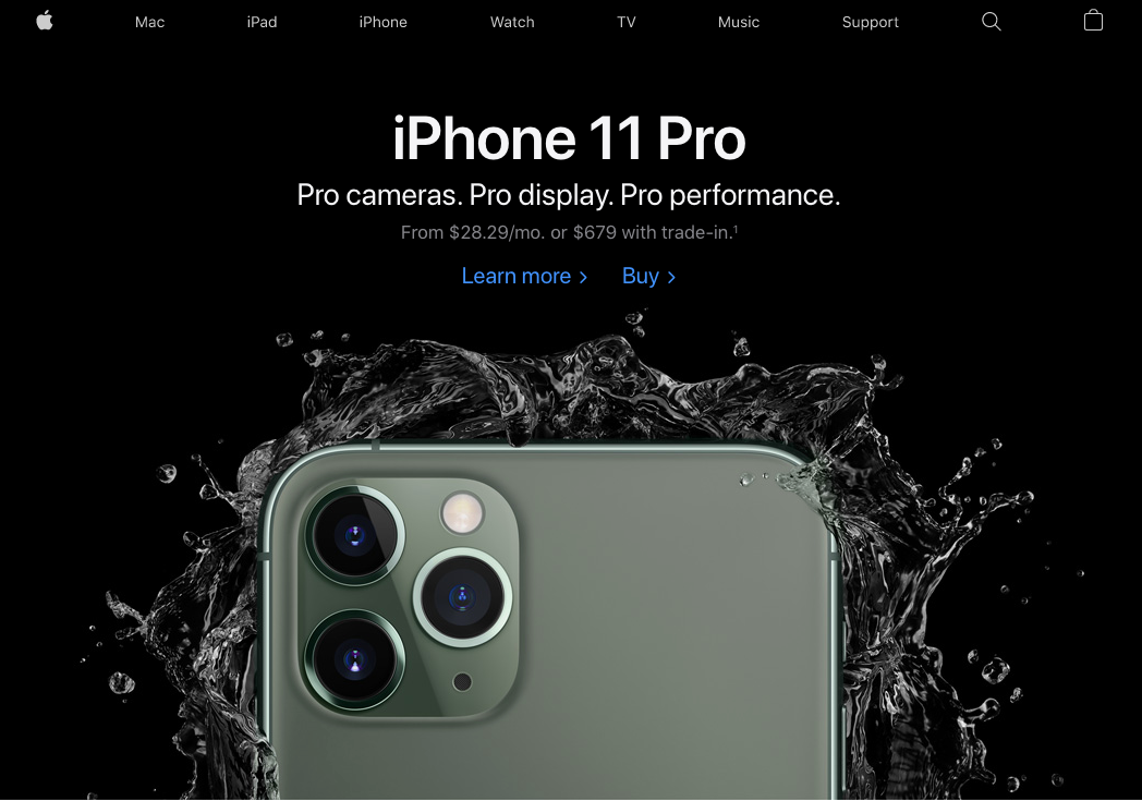
Be careful with large, image-focused layouts, as they can overpower everything else.
Soundcloud's image overpowers the account and sign-in buttons.
Apple's homepage is image-focued but serves a better purpose than Soundcloud.
`
Questions to ask yourself when choosing an image
- What emotions will it evoke?
- How will it support/reinforce the content?
- How will it guide or instruct?
- Does it strengthen and deepen understanding, or interfere/distract from it?
2. Focus on people
- We are wired to recognize and react with other humans.
-
We want to see people use what is being promoted.
-
An image of an individual using a product will always have more impact than an image of just that product.
-
Images of people looking away from the camera tend to work best because it makes it easier for viewers to imagine they are that person.
-
Avoid using inauthentic images of people. Usability tests show that purely decorative photos rarely add value to the design and more often harm than improve the user experience. Users usually overlook such images and might even get frustrated by them.
Inauthentic images leave the user with a sense of shallow, false pretense. A very simple rule of thumb is to use high-quality photographs of people who match your app's or website's character.

Show real, down-to-earth people and make sure that they really match your product's characters.
3. Limit large images above the fold
-
"Above the fold" is the upper half of the webpage that the user immediately sees without having to scroll.
-
Work to give users a reason to scroll and look at the rest of your site.
-
Make sure your image isn't so large that it pushes important, informative, or catchy content below the fold
4. Don't let your images look like banner ads
Users have learned how to ignore content that looks like advertising, called banner blindness.
Banner Blindness
The term was coined in 1998 when participants in an experiment still ignored large or brightly colored banners. Even banners containing helpful information regarding the task at hand were ignored. Additionally, banners located at the top of the page were ignored more than a banner at the bottom.
A study conducted by the Nielsen Norman Group asked its participants to find the country’s current population on the U.S census bureau’s website. Even though the answer was located on the site's homepage一top right corner in bright red color一it was found that 86% of participants failed to find the right answer.
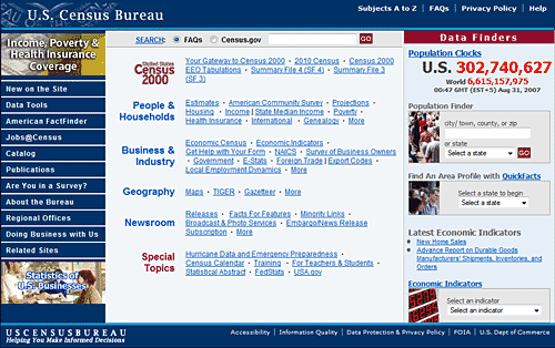
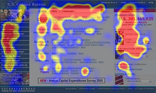
What's shocking is an eye-tracking study showed that many users looked directly at the answer!
5. Don't forget the power of illustration
-
An illustration can be much more impactful than photography
-
Mainly when the subject is something we see a lot, and as a result, are numb to it.
-
An illustration can be more relevant and appropriate to its content.
-
An illustration is an effective way of representing concepts and metaphors, where photography might be alienating.

Resources
Free Stock Images and Illustrations