UI Heuristics
"Design can be art. Design can be aesthetics. Design is so simple, that's why it is so complicated."
— Paul Rand
UI Design is a subset of UX. They share a common goal; to provide a positive experience, but the UI Designer creates what you use to interact with the website or app. They are in charge of creating the following:
- Layout
- Device compatibility (responsive)
- UI Elements (buttons, icons, sliders, scrollbars)
- Colors
- Fonts
- UI interactivity (what does a button do when a user clicks on it?)
- Animations
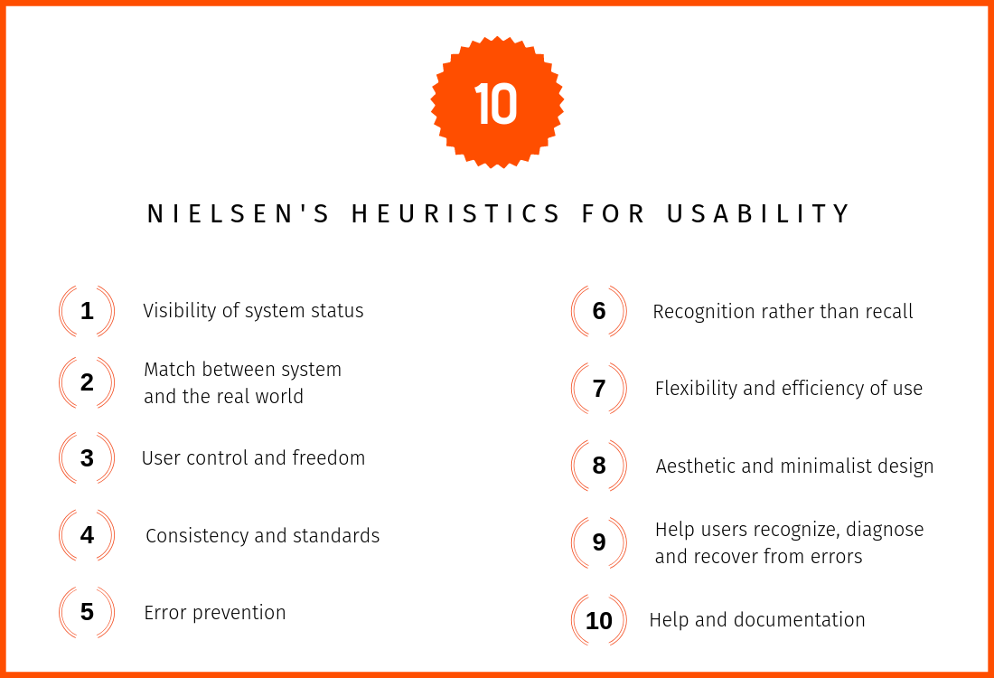
10 Heuristics for UI Design
The word heuristics loosely comes from the ancient Greek meaning to find or to discover. A heuristic is a guideline – an experience-based approach to problem-solving. Jakob Nielsen's create ten widely accepted UI heuristics in 1994.
1. Visibility of system status
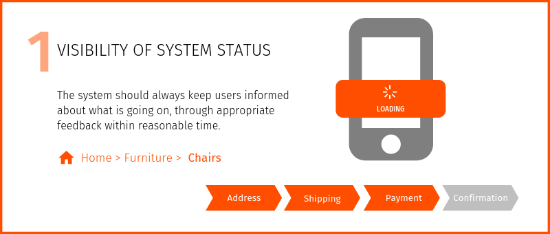
Informing users of the system's status makes the user feel in control and establishes trust. Many system tasks are happening outside the user's awareness, but when necessary, users should be informed of underlying tasks.

Appropriate Feedback
Every time a user interacts with the system, they need to know if that interaction was successful (Gulf of Evaluation). Did the system actually catch that button press, or was it busy with something else, and it ignored it? Was the item added to my shopping cart?
Feedback can be a simple change in color or a progress indicator (as shown above). These indicators tell the user that the system is working and reduces stress or uncertainty in the user, preventing users from clicking the submit button multiple times.
Even when users cannot see the effect of an action because the system does not have a screen (like the case for voice-only devices such as Amazon Echo and Google Home), feedback that the command was heard is essential. Amazon's Echo displays a ring of light on the device to indicate that it is currently listening or working on the command.
Compel Users to Action
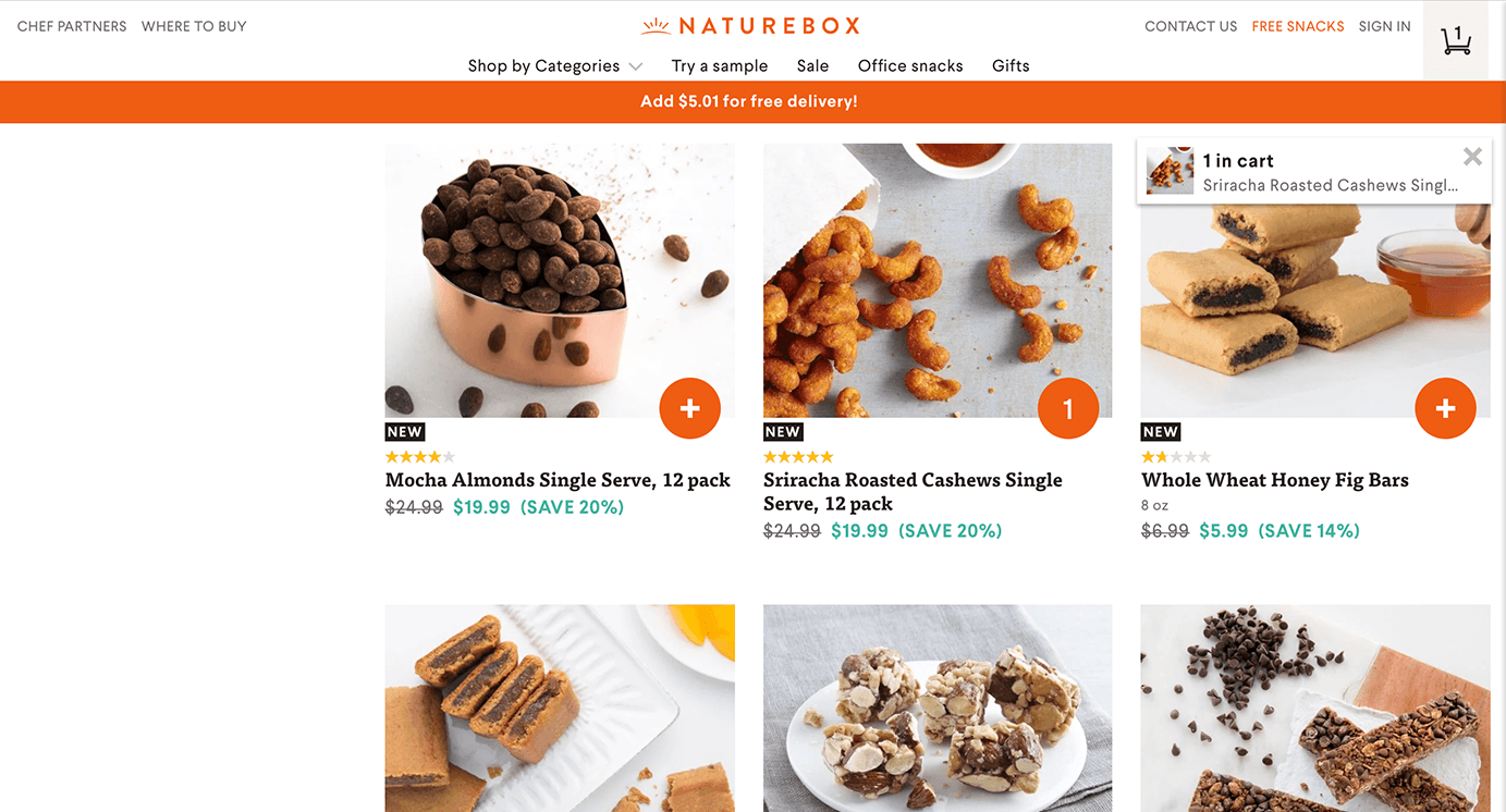
We don't need to let our users know about complex background processing; they have no interest in all processing tasks. However, sometimes backend aspects can benefit the user. For example, telling users on a shopping site that an item is low or out of stock. This information would benefit shoppers.
Nature box communicates to its users how close they are to qualifying for free shipping.
NNGroup - Visibility of System Status
2. Match between system and the real world
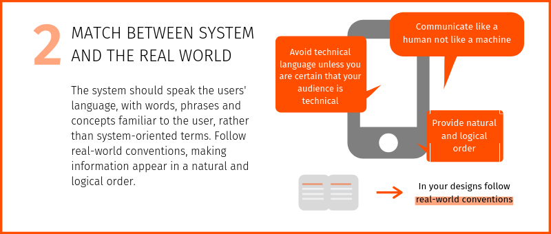
Use Familiar Language
If users do not understand the terms on your site, they will leave, feel ignored, or be confused. Familiar or commonly used terms are better for SEO (Search Engine Optimization) because they are what users search for.
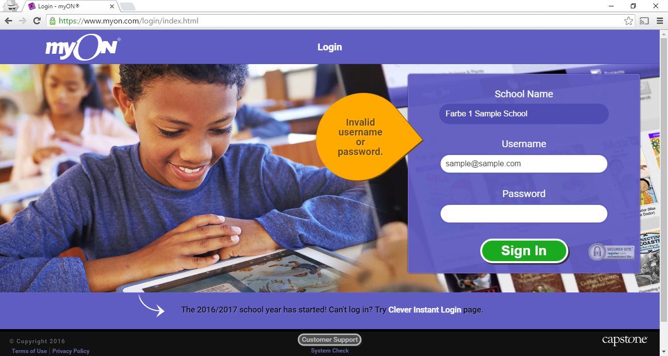
Example: Abacus Next
The Abacus Private Cloud Quick Facts page uses technical jargon that only a specialized IT professional (not their user) would understand. The text also includes several acronyms without explaining what they mean.

The site went through a re-design after the above screenshot was taken. The technical jargon was removed along with acronyms.
Real-World Objects
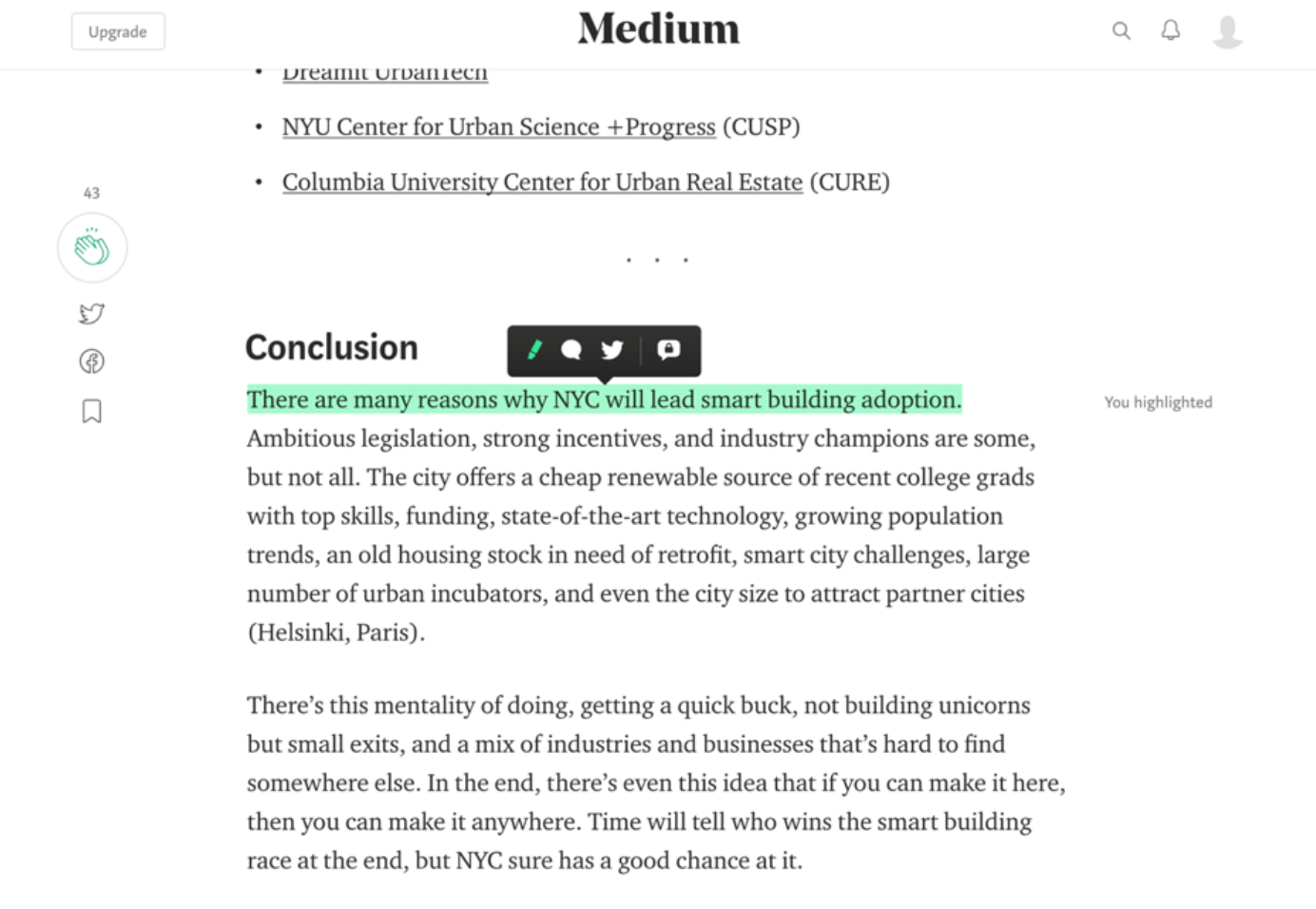
Skeuomorphism is a design concept of making items represented resemble their real-world counterparts. The "trash can" is, perhaps, the most recognizable skeuomorphic object. Another example is the compass app on the iPhone. It functions as an actual compass does in real life.
Our mental models of how a system should work are based on past experiences with real-world objects. Therefore, when users transition from the physical world to the digital world, they carry those interpretations with them.

In addition to making the digital work look like the physical work, we also need to make the system feel familiar. For example, sending a text message feels like sending a note, viewing photos online can feel like paging through a photo album, or choosing something to watch on Netflix can feel like flipping through TV channels. The website, Medium created the feeling of highlighting with a bright marker.
NNGroup - Match between system and the real world
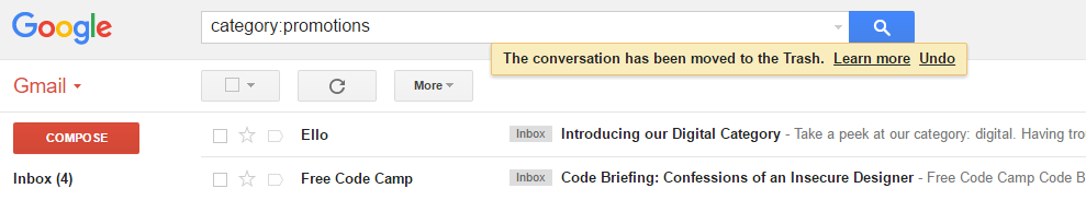
3. User control and freedom
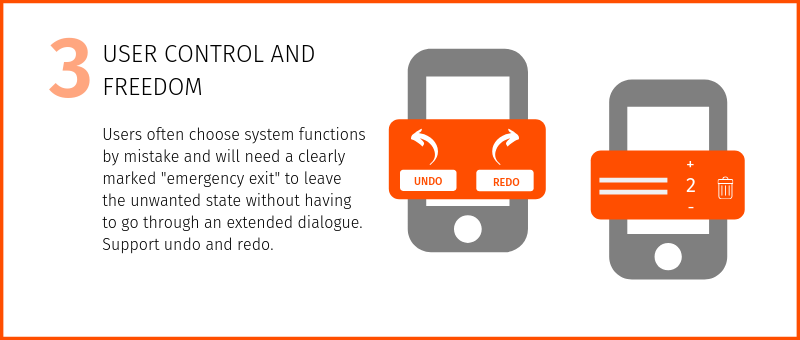
Users make mistakes, and when they do, they should be able to revert to a previous state. Clearly label an "emergency exit" for users to undo an undesired action.
4. Consistency and standards
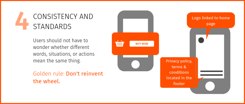
Consistency reduces learning and eliminates confusion. Each interaction that takes place between the user and the screen requires some cognition. You want to keep things as easy as possible. Reducing learning means that the user does not need to relearn a task because the interface for that interaction looks different.
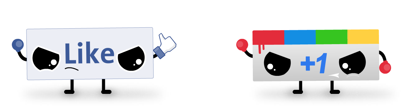
Google Plus ambitiously launched "+1" to counter Facebook's "Like" without much success. Facebook's "Like" already became a standard, and sites like LinkedIn adopted it without contesting.
Language choice
Users should not have to guess if different words mean the same thing, so your terminology should be understandable and consistent throughout the site. There are dozens of email apps on the market; however, they all use the same terminology (inbox, drafts, trash, spam). Users are familiar with these terms and expect to see them.
Use UI elements as intended to be used
Similar to words, users widely understand certain graphic elements. For example, radio buttons are meant to be used when there is only one choice. Checkboxes are used when the user is allowed more than one option. Failing to use these common visual representations will cause the user to pause and reduce the speed at which they complete their desired task.
Use well-established conventions for layout
As with terminology and graphic elements, the layout should be consistent. Users have developed an expectation of where certain elements should appear on the screen. Logos are typically on the upper-left, while the search and utility menu appear in the upper-right.
Create consistent visual elements
All visual elements (content, UI elements, fonts, backgrounds, colors) should be in harmony and feel consistent. Often this is done by the companies branding or style guide that is provided for you.
Design for user expectations
Users all have mental models of a system or website. Mental models are based on what the user "believes" about a system or website, not facts. To make things difficult, each user may have a different mental model for the same interface. The goal is to have your website match the user's mental model. One of usability's big dilemmas is the common gap between designers' and users' mental models.
5. Error prevention
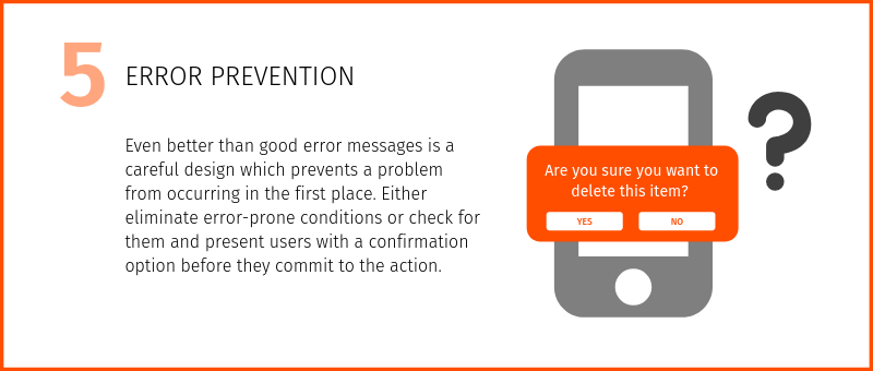
It is best to design an interface where errors are less likely to happen. Users hate making errors or feeling like they did something wrong. If they make a lot of errors, they are likely to leave your website or app. Therefore, as much as possible, design a system so the user cannot make a serious error. If an error is made, the system should be able to detect it and offer a simple solution.
There are two main types of human errors that can happen: Slips and Mistakes.
Slips
Slips are errors of execution. They occur when the user intends to perform one action but ends up doing another. For example, typing an "i" instead of an "o." These typically happen when the user is on autopilot, and are not fully concentrating on the task at hand.
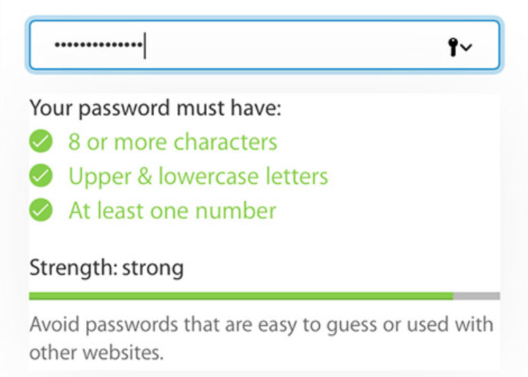
- Include helpful constraints (not allowing a birth date in the future)
- Offer suggestions (offering contextual suggestions while the user types)
- Good form defaults
- Forgiving formatting (allow multiple formatting options for telephones)
- Ensure that mouse/tapping targets are large enough and well-separated
- Provide clear & constructive error messages
- Confirmations for important or irreversible actions
Mistakes
Mistakes are errors of intention. They happen when users have goals that are inappropriate for the task at hand. Mistakes are conscious errors and often arise when the user has incomplete or incorrect information about a task. The users' mental model of the interface isn't correct, and users form a goal that doesn't fit the situation well.
- User Testing: conducting multiple user research and testing helps to understand why users are making mistakes and how to correct them.
- Follow Design Conventions: users have been trained on how to use common interactive elements.
- Preview Results: For complicated tasks, ofter users a chance to preview the effect of an action with their goal. For example, the iPhone offers a preview of the effects of changing the size of icons and text in the accessibility menu. Making this change takes the system time to complete, so showing a preview of the completed result helps users evaluate their decision
6. Recognition rather than recall
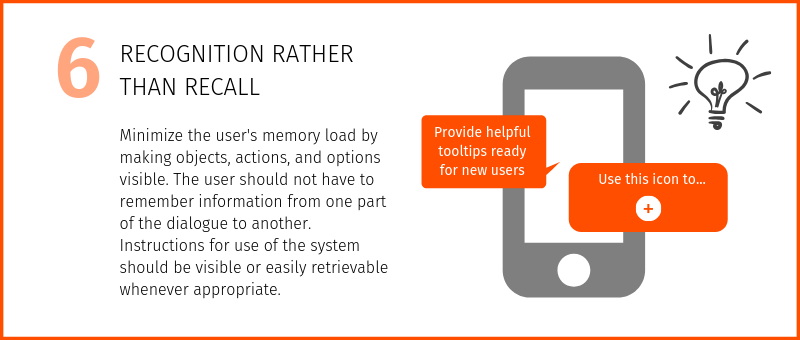
Recognizing something is easier than remembering it, so you want to reduce short-term memory load as much as possible. Basically, don't force users to remember things. One example of something we are all stuck having to remember is our username and password. Often users create the same password for many sites to reduce this burden or take advantage of a password manager.
The use of app icons on our smartphones is an example of how we recognize certain applications rather than remembering them by name. They increase productivity and decrease the feeling of disorientation. The icons reduce recall when trying to locate something.
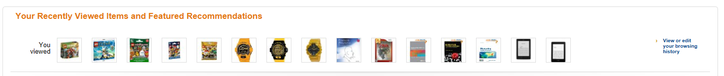
Amazon (and many other e-commerce websites) show users lists of items that they visited recently. These lists help users remember to finish a purchase that they may have started a few days ago. They promote recognition because users don't need to remember information that they may have seen in the past or recall what that product might have been called.
NNG - Memory Recognition and Recall in User Interfaces
7. Flexibility and efficiency of use
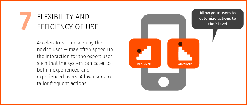
When possible, allow users to personalize frequent actions (shortcuts). Abbreviations, function keys, hidden commands, and macros are helpful to expert users. When we interact in the real world, it is often easy for users to take shortcuts quite easily. However, when we are dealing with interfaces, each "quicker" method needs to be programmed. Programming the interface to enable users to move quickly, customize, or establish their shortcuts will keep users happy.
8. Aesthetic and minimalistic design
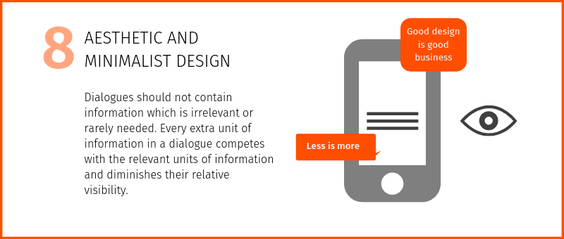
Minimalist doesn't mean limited. Simplify interfaces by removing unnecessary elements or content that does not support the user's tasks. Remember that users scan the web, so it's essential to remove any irrelevant information that will hinder the user from finding what they are looking for.
When the user is completing a specific task, make sure all the elements on the screen are relevant to that task. Otherwise, users become distracted, confused, or frustrated with the amount of information and options presented.
Four tips for keeping a minimalistic design.
- Show only relevant things to the user
- Maintain hierarchy
- Keep "Above the fold" in mind
- Get rid of the extra mass
9. Help users recognize, diagnose, and recover from errors
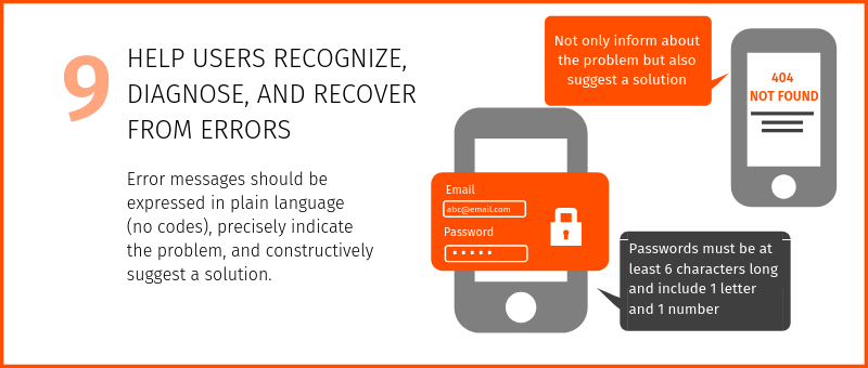
Designers should assume users are unaware of technical terminology, so error messages should be expressed in plain language to bring problems to the user's attention, and solutions should be worded to ensure nothing gets lost in translation.
Raw Error Message
Think of your error message as a conversation with your user — it should sound like they've written for humans. Make sure your error message is polite, understandable, friendly, and jargon-free.
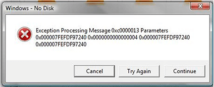
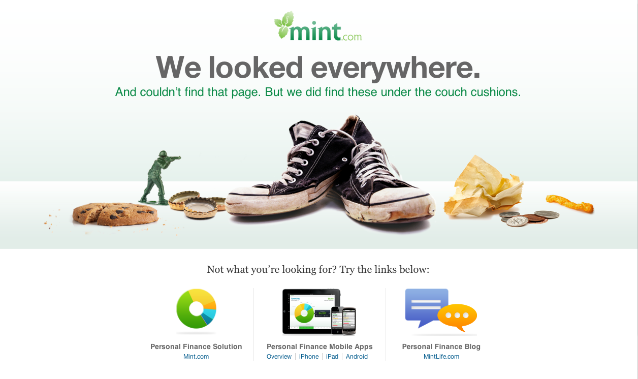
How could this error message be improved?
Mint's 404 Error Page reassures the user that they are safe and provides a solution.
10. Help and documentation
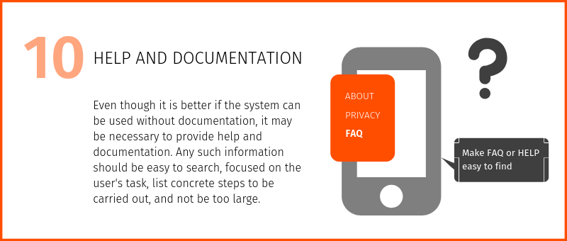
Extra Reading & Examples
Nielsen’s 10 usability heuristics illustrated by Revolut’s solutions