Buttons
“How do I explain what I do at a party? The short version is that I say I humanize technology.” Fred Beecher, Director of UX, The Nerdery
What is a Button?
Well, this seems like an easy question. It's what we click, press, toggle, and interact with! However, the interactive control can be a source of much user confusion if not designed properly. Modern UI buttons can be diverse and serve a multitude of purposes. Considerable time and effort is necessary to ensure an effective button is naturally integrated in the the overall design and layout.
Types of UI Buttons
CTA Button
A CTA or Call to Action button is an action button that will prompt users to sign up, register, buy now, etc. It should be used where you want your users to take a certain acton. It is engaging and must grab the users attention to persuade users to take action.
It's helpful to:
- Use contrasting colors
- Add extra whitespace around the button
- Start with a verb
- Make it visible without scrolling
- Make it large with rounded corners. Why rounded? This has been studied, of course, and rounded corners have proved to be more effective with users.
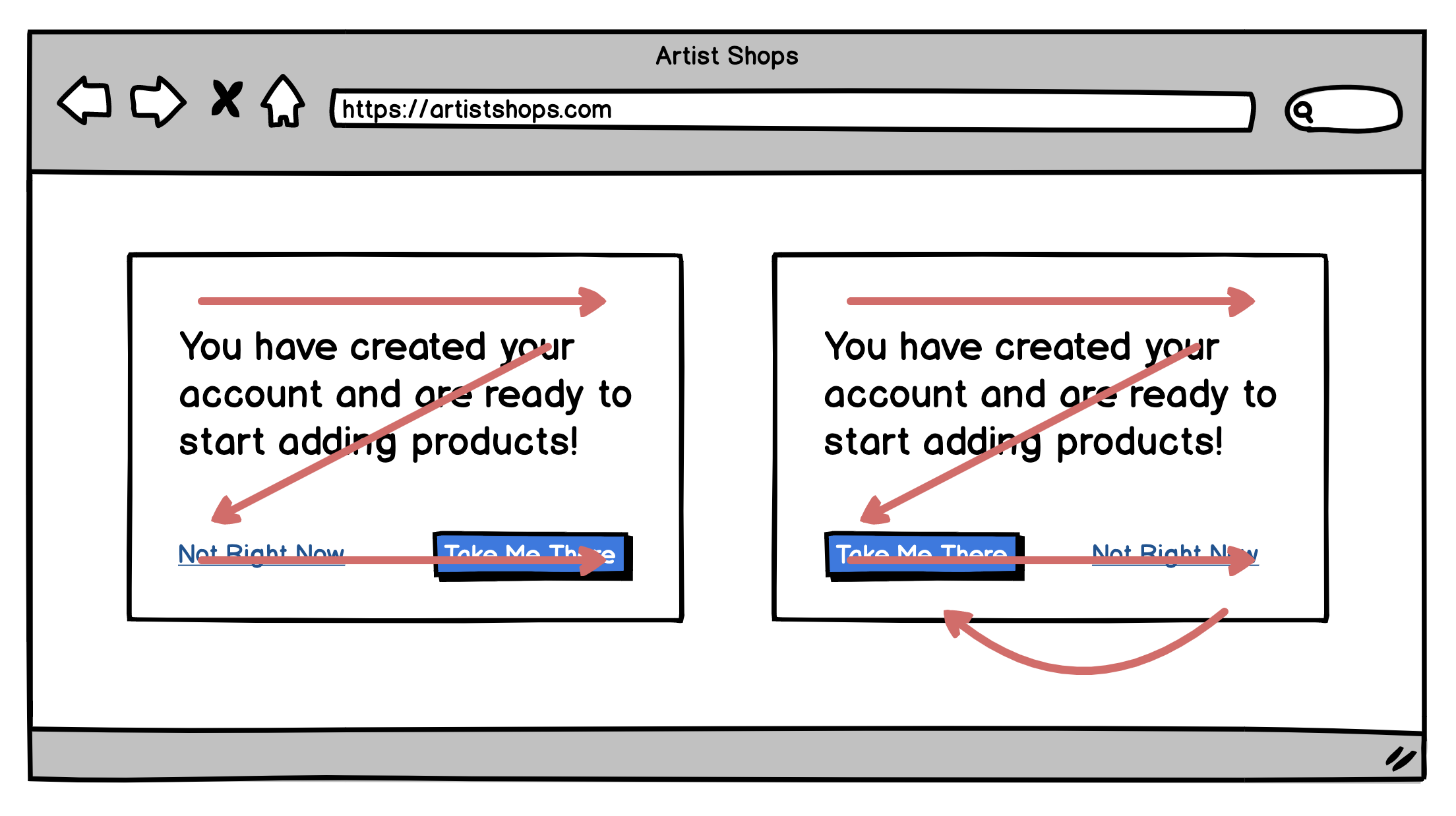
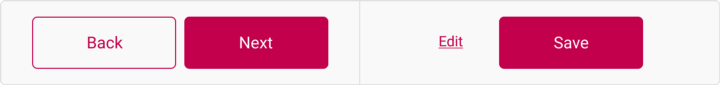
Primary Action
While a CTA button and a primary button can look the same, they serve different purposes. CTA buttons are what the interface would want you to do, primary buttons are a strong visual indicator helping users complete their journey. Primary buttons should be used in situations where the user may want to go ‘next’, ‘complete’, ‘start’, etc.
- Don't have more than one Primary Action Button on the screen at a time.
- Placement matters, depending on the screen size.
Smaller Screen Size
Full Page Designs
Secondary Action
Secondary buttons are the ‘go back’ to the primary button’s ‘next’, or the ‘cancel’ button to the ‘submit’ button. Secondary buttons are the alternative we give users to the primary action. Typically Secondary Action buttons tend to use line buttons or text links as secondary buttons.
Button Styles
Solid Buttons

Due to the boldness of a solid button, they grab attention and are often used for CTA buttons and primary buttons.
Line or Ghost Buttons

A ghost button typically has no fill and show the background through the button (only the outline is visible). Testing has shown they grab less attention than solid buttons; therefore making it better for secondary buttons.
Rounded Buttons

Rounded edges are commonly perceived as friendly, safe, and inviting. This is a classical conditioning principle where our brain is conditioned to think sharp objects can be harmful. Additionally, there have been studies to show that rounded edges are just easier on the eye, when compared to a rectangle or square.
Square Buttons

Square or sharp edge button have proven to be more harsh to the eye; however, square corners are appropriate for some use cases. They can be effective at grabbing the users attention for important or emergency-like content boxes. They also are preferable when needing to arrange several buttons together.
My advice is to avoid 0px corner radius (square) and do some very subtle rounding (3-10 corner radius).

Gradient Button

Gradients can give user interfaces a natural look at feel since it produces more depth.
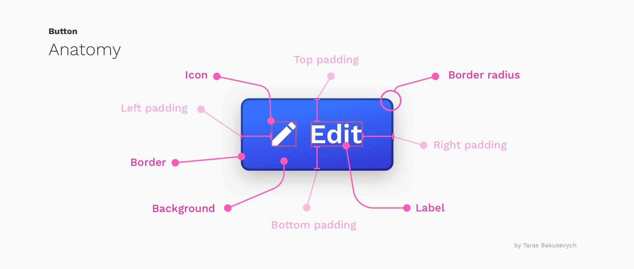
Icon with a Label Button

If using an icon, place the icon to the left of the label. Since users scan for left to right, placing the icon to the left helps users identify a buttons purpose faster. Make sure to follow the same iconography rules discussed in the Icons lecture.
Button Sizes
The length of the button may vary depending on the content it holds. However, the height is usually consistent with the purpose of the button used.
- Smaller buttons: 42 pixels in height
- Standard buttons: 60 pixels in height
- Larger buttons: 72 pixels in height.
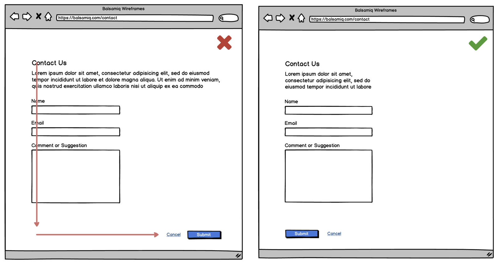
Button Labels
Users should clearly understand what happens when they click on a button. Imagine you just clicked the "Delete" button on an email and you see this.

Many users in this position will question what Cancel represents. Instead of saying OK, it's better to use Delete. This makes clear what this button does for the user. Additionally, since this is a potentially dangerous action, you can use a color like red to state this fact.

When possible use verbs to indicate what the button will do.
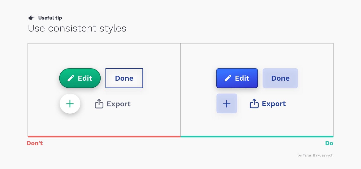
Consistency
What ever style you choose, be consistent in your design!
Use consistent:
- Border Radius
- Height (for similar purposed buttons)
- Text case, e.g. title case, sentence case, all caps.
- Color