Typography
"Web Design is 95% Typography."
— Oliver Reichenstein
Ninety-Five percent of what we see onscreen is text-based. The job of UI designer is to organize and interpret this text in a way that the user can find information quickly.
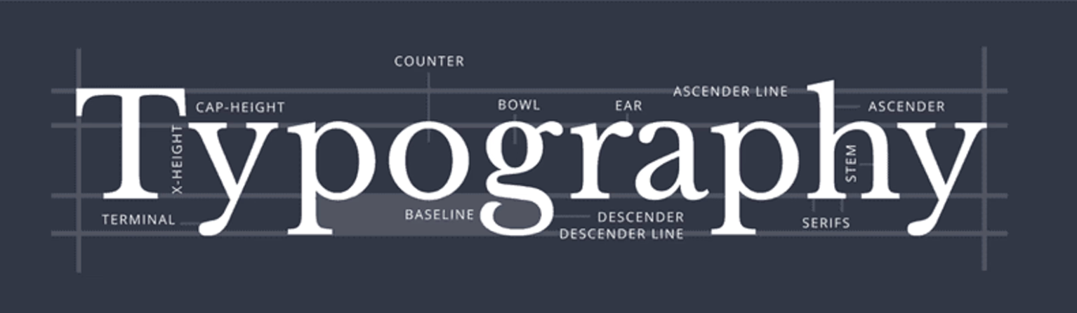
Terms
There are many terms related to typography, as you can see from the image below! We'll focus on the terms required for web designers and developers.
Font & Typeface
These two terms are often thought of as synonyms, but that is incorrect.
A typeface is a style of type which includes the complete scope of characters in all sizes, styles, and weights. Helvetica is an example of a typeface. In CSS, we define a typeface with the property `font-family'.
A font, is a specific representation of one particular typeface (size, style, and weight). Helvetica 14px bold, would be a font.
Weight
Depending on the typeface, there are different weights available to use. In CSS, they are defined by a numeric value or a name with the font-weight property.

Baseline

The baseline is the invisible line upon which a line of text rests. - When you have multiple text elements on a single screen, they should all share points of common alignment - Even if those "chunks" are unrelated, alignment helps keep the layout ordered and makes it easy and quick to scan
Leading or Line-height

Leading is the spacing between the baselines of the copy. Appropriate leading helps readers easily go from one line of text to another. In CSS, you can adjust the leading with line-height.
Tracking or Kerning
The space between each character. Designers often choose to adjust the kerning between two specific letters to make it feel more natural and even. In CSS, you can adjust the kerning with letter-spacing. You can also adjust the space between individual words with word-spacing.
Text alignment

Serif vs Sans-serif

Serif fonts have little tags on the edge of letters. They include fonts like Times New Roman, Georgia, and Garamond. Sans-serif translates to "without serif," so they are your straight-edged fonts like Ariel, Helvetica, Gill Sans, and Futura.
The Trinity of Typography

- Font-size
- Line-height (leading)
- Line length
These three parameters are all related to each other. If you adjust one, the other parameters might also need to be adjusted. Having a balance of size, line height, and line length helps legibility.
Font Size
This is not a science, although some developers and designers use mathematical formulas to determine font sizes! Types scales can be built to successive text sizes by the gold ratio, which is 1.62. Checkout out this Type Scale Calculator. Basically, making the ratio between each font size the same. However, it doesn't have to be this complicated.
The purpose of different text sizes is to communicate importance by grabbing the users' attention. Use this principle to make important text large and less important text small. And be consistent!
- Start with a good body text size (16px - 20 px).
- Increase sub-headings (h2 - h3) to be large enough to be distinguishable while scanning from the body text; perhaps add a bold weight.
- Make the title (h1) large enough to stand out from the sub-headings but not so large that it will run over two lines.
Note about Heading Sizes
There is no one-size-fits-all rule for heading sizes, as it depends on the overall design and layout of your website; however, here are some commonly used sizes for desktop designs:
H1: 24-36 px
H2: 18-30 px
H3: 16-24 px
H4, H5, H6: 14-20 px
Choosing the body text size
Most websites can be categorized into two types: text-heavy or interaction-heavy.
Text-heavy sites
Text-heavy sites like news sites, blogs, and articles pages have a primary purpose of reading content and require less interaction. These sites need larger font sizes, so users don't have to strain their eyes while reading content.
-
16px – absolute minimum for text-heavy pages
-
18px – a better font size to start with.
-
20px+ – may feel awkwardly large at first, but it is always worth trying out in your design. One of the best-looking text-heavy sites on the web, Medium.com, has a default article text size of 21px.
Medium.com uses 21px for body text.

Madison College uses 16px for body text.

Interaction-Heavy Pages
For sites that have more interaction, smaller text sizes are acceptable. Since scanning is crucial on these websites, a distinct hierarchy is used. Use smaller text sizes for less important things and larger sizes for more important things, like titles and subtitles.
Woodman's Market rarely uses body text, instead focusing on interactive elements.

LinkedIn Learning is also an interactive site and uses smaller text overall.

Line Height
The line-height, or leading, should be at least equal to half the character height (this meets accessibility guidelines).
In CSS, line-height is expressed as a number value or factor of the font size, such as 1.5× or 150%. For example, 1.5× line-height on size 12 text is 18 (by math 12 × 1.5).
main p {
 /* use at least 1 and 1/2 the height of the character */
 line-height: 1.5;
}
The default line height for most browsers is only 110% (1.1) to 120% (1.2). This must be increased, especially for the following:
- Small text sizes.
- Wider paragraphs.
- Longer paragraphs.
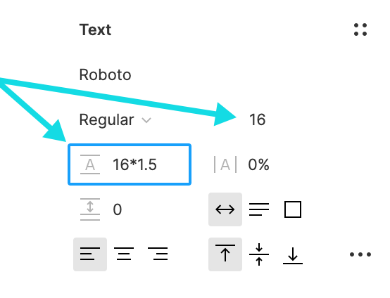
In Figma, you can adjust the line height by typing in the font size and multiplying it by a value directly in the box.
Line Length
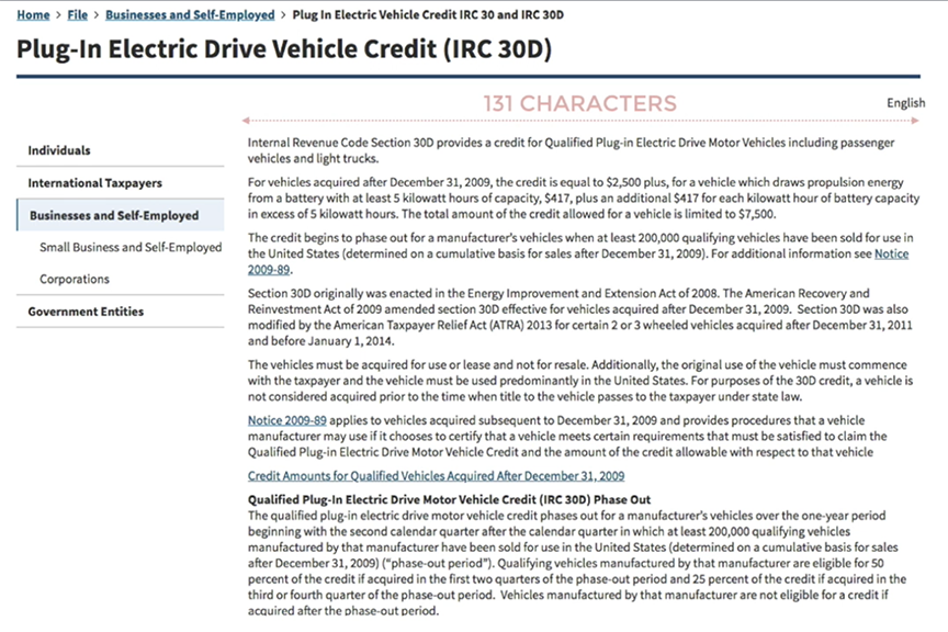
When line lengths are too wide, the eye has to work a lot harder to "track" the text by following and finding the beginning of the following line. This makes reading and comprehension more difficult and much slower! In fact, when users read lines that are too long, they will forget the content they are reading. However, if the line is too short, the eye has to track back and forth too often, breaking the reading rhythm.
- Keep lines between 60-75 characters long for desktop
- Keep lines between 35-40 characters long for mobile devices
Below, this long line length causes reader fatigue and reduces comprehension.
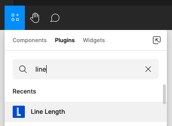
Thankfully, we have a great plugin in Figma to help with this!
- In Figma, navigate to the Resources icon (top menu).
- Search for "Line Length" under plugins.
- Click Run.
In the browser, you can install a Chrome plugin to test your character count.
Test your Type Eye
This game tests your ability to build the "perfect" balance of font-size, line-height, and line-width. It's not easy!
How high of a score can you get?
The Equilateral Triangle of a Perfect Paragraph- A Web Typography Learning Game
Hierarchy!
One of the most important methods for effectively communicating is the use of typographic hierarchy. Hierarchy helps us improve the scannability and readability of an interface by making it easier for users to find important information quicker.
Using size, weight, typeface, color, position, and contrast, we can tell our readers what is important, what should be read first, what can be read last, and more.

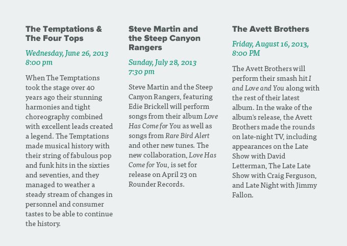
Take a look at this example from Understanding Typographic Hierarchy. The designer establishes an order of importance with the title, date, and descriptions in the below text.
Without Hierarchy

With Hierarchy
Or, this example from Type study: Typographic hierarchy. The graphic designer has used only spacing, alignment, weight, size, and color to help guide the user's eye around the design.

Type Tips
-
Use White Space! Place space around elements. "Chunk" related elements together.

-
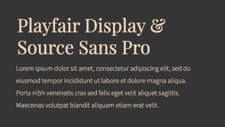
Limit the number of typefaces (two or three max).
Pairing Serif and San-serif create contrast.
-
Build a type system (you will be doing this in your assignment).

Typographic Resources
Figma Plugin: Font Preview