UI Patterns
d> "Simplicity is the ultimate sophistication."
— Leonardo da Vinci
The layout of your pages should be one of the first things you tackle, but how do you decide on a layout? Thankfully, there UI Layout Patterns that can help. These patterns help to solve common design problems by presenting content in the most intuitive and useful manner.
Progressive Disclosure
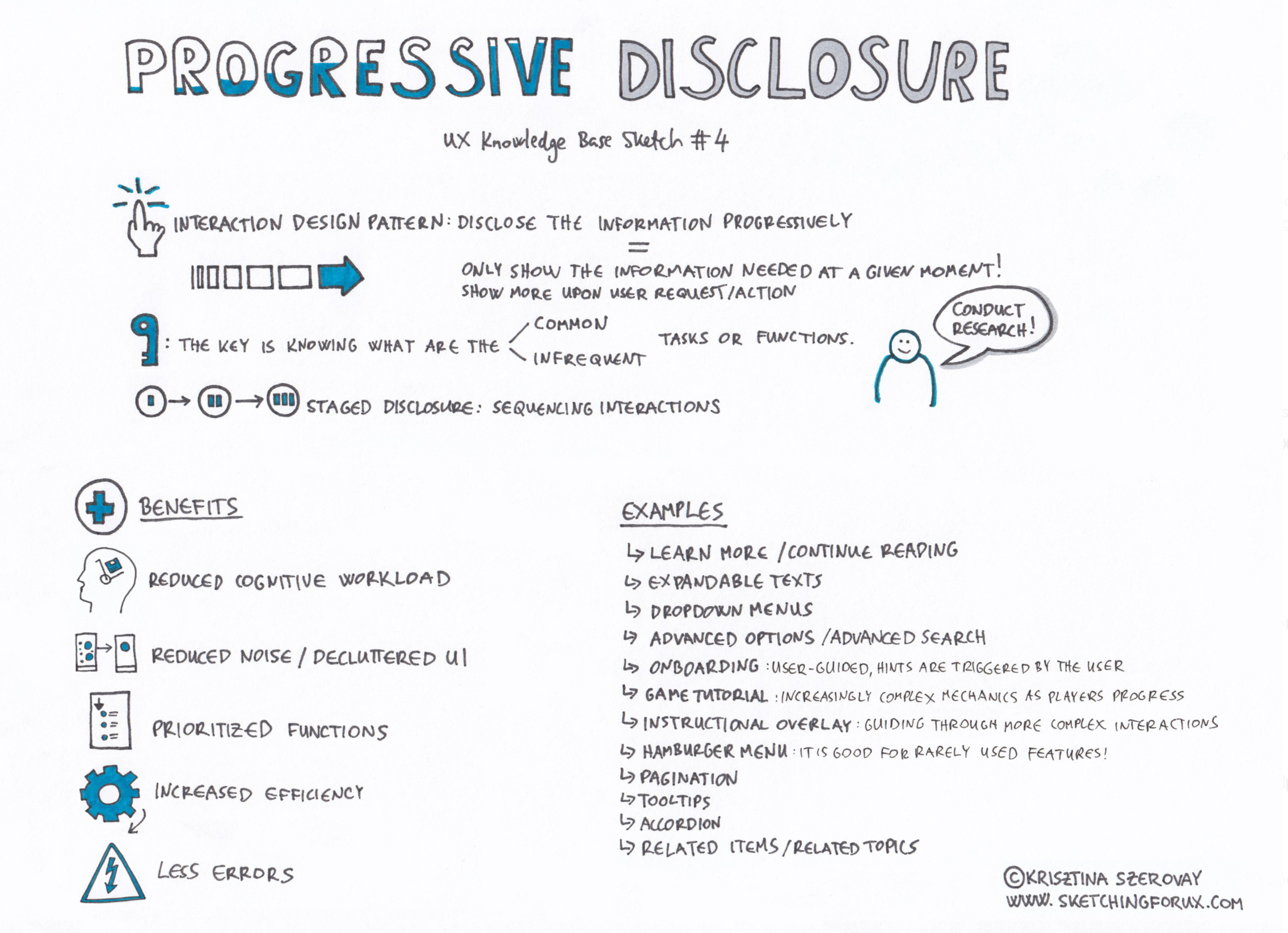
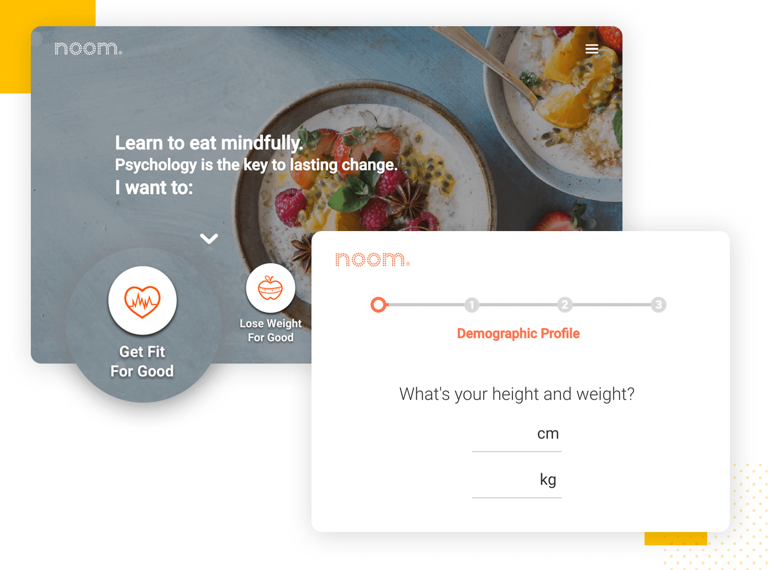
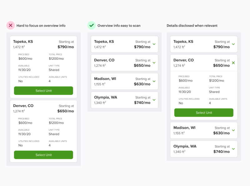
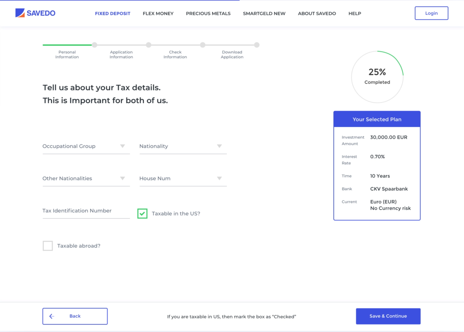
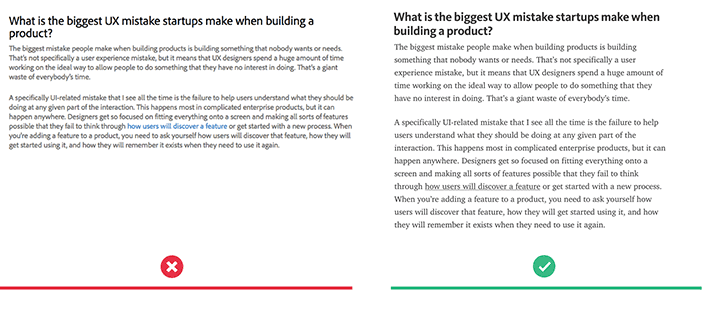
Progressive disclosure is an excellent pattern for complex websites and applications with a lot of information. Today's apps have so many commands, features, and options it can make for an overwhelming user experience. By using progressive disclosure, you only show the information necessary at that point in the interaction.
Progressive disclosure is a powerful way to ensure users don’t get overwhelmed by the new information. By disclosing more information on sequential screens, or by hiding content until it's requested or needed, you can break up tasks into small manageable chunks. Put another way, only show what the user needs at a particular moment. Progressive disclosure is all about waiting until users are ready to deal with the most complex or less entertaining aspects of the product.
Progressive disclosure is best when you need the user to focus on the task at hand with as few distractions as possible, while still being able to access more details if necessary.
 Source: Krisztina Szerovay
Introduce features as users progress
 Source: Justinmind
Accordion
 Source: UX Movement
Step by Step Wizards
 Source: Dribbble
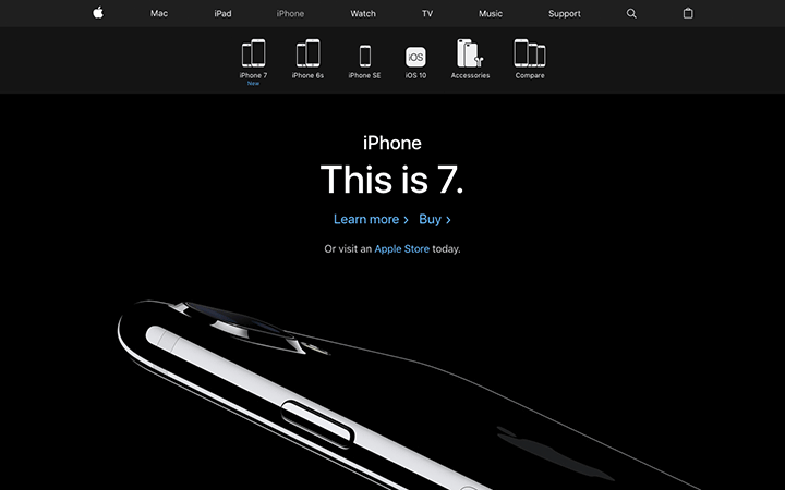
Weather Apps
Think about the weather app you use on your smartphone. How many times do you actually venture past the very first screen? And when you do, why?
The majority of weather apps on other platforms work the same way. They're designed with the user's immediate information needs in mind. There's more detail available, but you're not forced to deal with it if you don't need it. That's progressive disclosure in a nutshell.
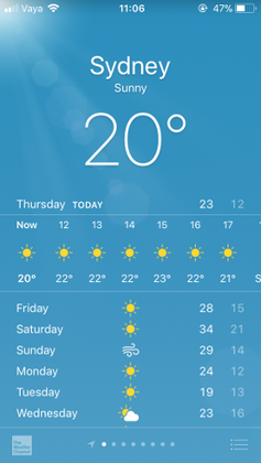
There are some drawback to Progressive Disclosure
- Users are forced to wait until you are ready to show them more information.
- Repeat users may not require progressive disclosure (depends on the task).
- Over-constraining what users see, or dumbing it down too much.
Carousels
They're useful if you want to highlight large chunks of content but don't have space. They are commonly used on e-commerce websites to display the latest offers or a new range of products.

Pros
- Optimizes screen space.
- Visually appealing. Psychology has proven that people are attracted to images.
- It can grab visitor's attention.
- Proves fresh and new content.
- Shows visitors what's important.
Cons
-
They can be ineffective. Many users are trained to skip over things that appear to look like ads. Many experts refer to this as banner blindness.
-
They can lead to frustration. Auto-forwarding carousels and accordions annoy users and reduce visibility.
-
They can move too fast. Once the user decides that something might be of interest, it's yanked off the screen — replaced by something you don't want.
-
Low Click-Through Rates. A 2013 study found that only 1% of site visitors interact with a homepage carousel. Of that 1%, 84% to 89% interact with just the first slide. Yes, this is an old study, but I think it's still relevant today.
Tips for use
- Use when you have a large set of items to show, but want to let the user concentrate his or her attention only on a select few items at a time.
- Use when you want to tease the user by letting him or her know that there are more items available than what is currently shown.
- Use when you do not have enough space to show all items at once.
- Use when you have highly visual items to display, such as movie posters, album covers, products, etc.
- Do not use when the items are non-visual such as links to text articles, PDF documents, etc.
- Do not use when an image cannot immediately identify the content it's linked to.
Breadcrumbs
Breadcrumbs let users know where they are on your site, preventing users from getting lost or frustrated. They also communicate the hierarchy in the informational architecture of your website.
Breadcrumbs are typically separated with a > symbol and found below the main navigation. Other symbols used are arrows pointing to the right, right angle quotation marks », and slashes /. The choice depends on the aesthetics of the website and the type of breadcrumb used.
Pros
- Convenient for users.
- Reduce clicks or actions to return to higher-level pages.
- Does not take up a lot of screen space.
- Reduces bounce rates. For example, say a user arrives on a page through a Google search, seeing a breadcrumb trail may tempt that user to click to higher-level pages to view related topics of interests. This, in turn, reduces the overall website bounce rate.
Cons
- Some sites use breadcrumbs when you don't need to.
Tips for use
- Use when the structure of the website follows a strict hierarchical structure of similarly formatted content.
- Use when the user is most likely to have landed on the page from an external source. For instance, from a blog or a search engine.
- Use when the page in question is placed relatively deep into the hierarchy of pages and when no other form of visual navigation can show the details of the same deep level.
- Use together with some sort of primary navigation.
- Do not use alone as the main navigation of the website. Breadcrumbs should be thought of as an additional feature and not replace effective primary navigation menus.
- Do not use on the topmost level of the hierarchy (typically the welcome page)
- Do not use for single-level websites that have no logical hierarchy or grouping.
- The term 'breadcrumb' is deceptive, as it implies the history of how the user got to that page. A more correct term would describe the current location's place in the hierarchy of the website.
Card Pattern
We've seen a card pattern used for navigation, but it is also useful for the layout of the site. Cards are used when there is a lot of content to present by clearly organizing information. They combine both text and images for an interactive design.
Typical card layout

Pros
- Good to use when the user needs to browse content of varying types and lengths.
- Responsive design (cards can easily be arranged to fit any screen size).
- Shareable content is easily displayed.
- Easy to display multiple content types (images, text, call-to-action buttons)
- It creates a positive experience for users that want to browse for information, rather than searching.
Cons
-
Cards are less scannable than lists. Thus, cards are not appropriate when users need to search for a specific item or piece of content.
-
You have a list of similar items. A standard list is more appropriate for these cases because it is harder to scan content in a card layout.
-
When you have a strict order in which content should be displayed. There is little hierarchy achieved when using cards, which makes all the content look similar.
-
Cards take more space. Because cards are bigger than a line of text, any given screen size can't show as many cards in a single view as would be possible in a list view.
-
Poor choice when users need to compare multiple options. Cards aren't structured predictably from item to item - eye-tracking research has shown that users have a difficult time looking back and forth between items.
Tips for use
-
"One card, one concept". The card contains different elements, but they should all be about a single object.
-
Use whitespace generously. Give each card room to be seen, read, and understood. Apply whitespace around and within each card.
-
Limit the content length. The card should only contain essential information and offer a link to more details.
-
Make the entire card clickable, not just certain portions.
-
Take advantage of animation and movement (hover).
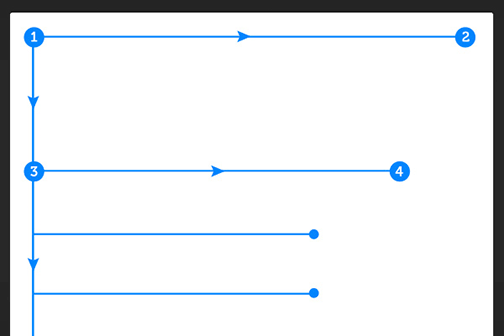
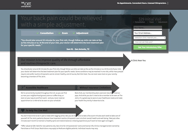
The F-Pattern
The F-Pattern layout relies on eye-tracking studies that show how users read a screen. Users read the screen in an "F" pattern (seeing the top, upper left corner, and left sides of the screen most, while only taking glances at the right side). Following this pattern means placing the most important elements (branding, navigation, call-to-action) on the left side.
- The logo and navigation occupy the visitor's attention first.
- Within the contest structure, images receive the greatest level of attention.
- Headlines come next.
- Text appears to be scanned, not read thoroughly.
Pros
- Good for heavy text websites (F-pattern makes the site easier to navigate and read)
Tips for use
- Place the most important content near the top of the page to communicate the site's purpose.
-
The first two rows are the most important. Users may leave the site if they don't find what they want there.
-
Users will read horizontally across the top, so this is a good place for the navigation.
-
Start paragraphs with enticing keywords and only cover one idea per paragraph.
-
Place CTAs (call-to-action) at the left and right sides, where the user begins and ends horizontal scanning. This momentary pause as they drop down gives them a little extra time to consider.
-
Use sidebars for related content, social media, etc. Anything that you want the user to see, but doesn't fit with the primary content.
The Z-Pattern
Similar to the F-pattern, the Z-pattern traces the route the user's eye travels when they read the web. As you would expect, this pattern follows the shape of the letter "Z". Designers may choose to use the Z-pattern over the F-pattern when they need to direct attention to specific points on the site. While the F-pattern is better for browsing heavy content, the Z-pattern guides users through more open pages.
Pros
- Best for sites that have a specific agenda or call-to-action.
- Best for sites that have a singular goal and less content.
Tips for use
-
You want people to see your most important information first and your next most important information second. Thus, important elements should be placed along the scanning path, and visitors should be presented with the right information at the right time.
-
Place CTAs on the right side, at the end of the line: users will slight pause here
-
The Z-pattern can be repeated over and over on the same page so that the user develops a rhythm that keeps them there
Negative Space
"If everything yells for the viewer's attention, nothing is heard."
- Aarron Walter
Negative space or white space is a design element. It should be treated with as much importance as any other element on your screen. Negative space increases the usability and navigability of the interface. Remember that users don't need everything at once, and too many elements raise the level of distraction.
Purpose of whitespace
-
Improving comprehension
Whitespace improves the scannability of your website, along with increasing legibility. Increasing whitespace between paragraphs and the left and right margins has been found to increase comprehension by up to 20%.
Optimize text by:
- Paragraph margins
- Line spacing (space between each line)
-
Clarifies Relationships
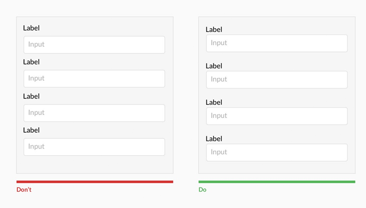
Whitespace acts as a visual clue to group certain items together. It helps the user organize visual information, where objects near each other are considered to be similar. An example of this can be found in web forms. Similar content is grouped together by adding margins or padding around similar elements.
-
Attracting Attention
There is a relationship between distance and attention - larger distance forces attention. Meaning, the lack of other elements helps make existing elements stand out more. Whitespace can be used to help lead the eye around the page. The more whitespace around an element, the more the eye is drawn to it.
-
Creating Feeling of Luxury
Whitespace is often used purely for aesthetic purposes. It creates a feeling of elegance for upscale brands.
Resources
Article: Viewing patterns: The subconscious psychology of the eye