Interaction Design
"Feedback is the heart of interaction. If user interaction is a conversation between your user and the product, then your product better participant in a friendly, interesting, and helpful manner."
— UXPin team tubikstudio.com
What is Interaction Design (IxD)
Interaction Design is one of the disciplines under UX that examines the interaction, through the user interface, between the system and its user. It also incorporates how the design and information should be presented within the system to enable the user to understand the information best.
How we interact with all products is important; we saw many examples of poor interaction design in our UI/UX Pass & Fail exercise. Interacting with the mouse, digital drawing tools, and touchscreens are all aspects of interacting with items that can affect the user experience in web development.
Affordance & Signifiers
In the book The Design of Everyday Things, Don Norman created two terms to describe how objects communicate their purpose to users.
Affordance
An affordance is something an object can do. What an object does is only revealed by the user through interaction. An affordance can be obvious or hidden; however, it should be perceivable or visible to the user for it to be effective.
For example, a chair reveals its affordance by design through its shape; it can be sat on. However, there are additional affordances not communicated by its design. A chair can be used to change a light bulb or reach a book (this would be a hidden affordance). So, affordance is determined not solely by design but by how a user interacts with it.
Signifiers
A signifier is an indicator that communicates affordance. It illustrates or describes what an object can do. It can be obvious or very subtle.
For example, some chair seats are concave. The concave seat acts as a signifier of the object's purpose. Regardless of that signifier, the chair's affordance is the same. It can still be sat on or stood on, but the signifier encourages the preferred use.
Doors that have handles signify that they should be pulled. Doors that have no handles signify they should be pushed. However, we've seen examples where this is not always the case.
Affordances & Signifiers in Websites
Using proper signifiers in websites is important in directing your users to interact with the site correctly.
-
Cursors can demonstrate what behavior is expected (pointers, pointing hand, i-beams, four-directional arrow).
-
Color can indicate many things within the user interface. Hyperlinks, buttons, and system states are all commonly signified with color.
-
Labels explicitly indicate the functionality
-
Metaphors in the forms of words or imagery that are often used to communicate something other than the actual meaning.

-
Patterns that are repeated among many websites can train a user on how they operate. For example, a carousel is common and usually has similar signifiers. Breadcrumbs are another example that users understand as a way to navigate the structure of a website. The more often a pattern is used, the stronger the habit becomes. Reliance on patterns can sometimes stifle creativity. You may come up with a better way to communicate navigation to your user, but it might be less intuitive simply because it's less familiar.
-
Mobile design relies heavily on signifiers to communicate how the user should interact. Users can tap, double-tap, drag, swipe, pinch, spread, and press and hold on mobile devices. It's up to the interface to communicate this functionality.
-
Hidden A hidden affordance in web design is when the actual affordance (purpose) isn't available until an action has been taken to reveal it. For example, needing to hover over a button to see whether it's clickable or dropdown menus that are hidden unless you hover or click on them. Often, this is done to simplify the visual complexity of design (usually on mobile sites). The drawback is that the user has to hunt for affordance; it's often a guessing game.
-
False A false affordance is all over the web, primarily by accident. An example is a button that looks active but does nothing or a logo that isn't linked to anything. False affordance happens when details are missed, like a broken link. Other times, it's caused by not fully understanding the user.
Interaction Model
Don Norman developed the interaction model (or action model). It illustrates the sequence users take when interacting with a product. It can provide insight into ways systems fail or cause problems when users attempt to achieve their goals.
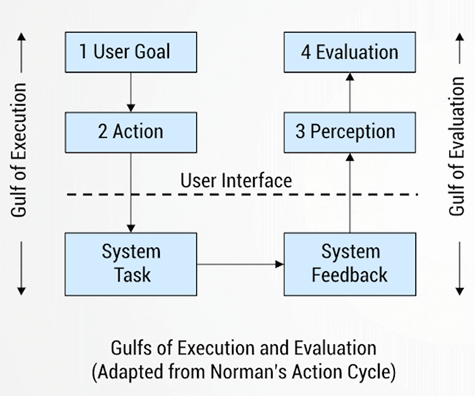
Gulf of execution (action)
The difference between user's formulation of the action to reach their goals and the actions allowed by the system.
- Need to be as small as possible (least amount steps)
- Lest amount of cognitive effort
- Leads users to their goals
Gulf of evaluation (feedback)
The difference between the physical presentation of a system state and the expectations of the user.
- Feedback must be perceptible to all users and understandable
- Perception: User must be able to hear/see/feel the system response to an action
- Interpretation: a user must be able to understand the symbols/graphics/sounds/text in context
- Evaluation: a user must know when the action is complete (have I done it?)
Feedback Examples
The type of feedback we provide depends on the interaction the user completed. These sketches illustrate the different types of feedback we encounter while interacting on the web.
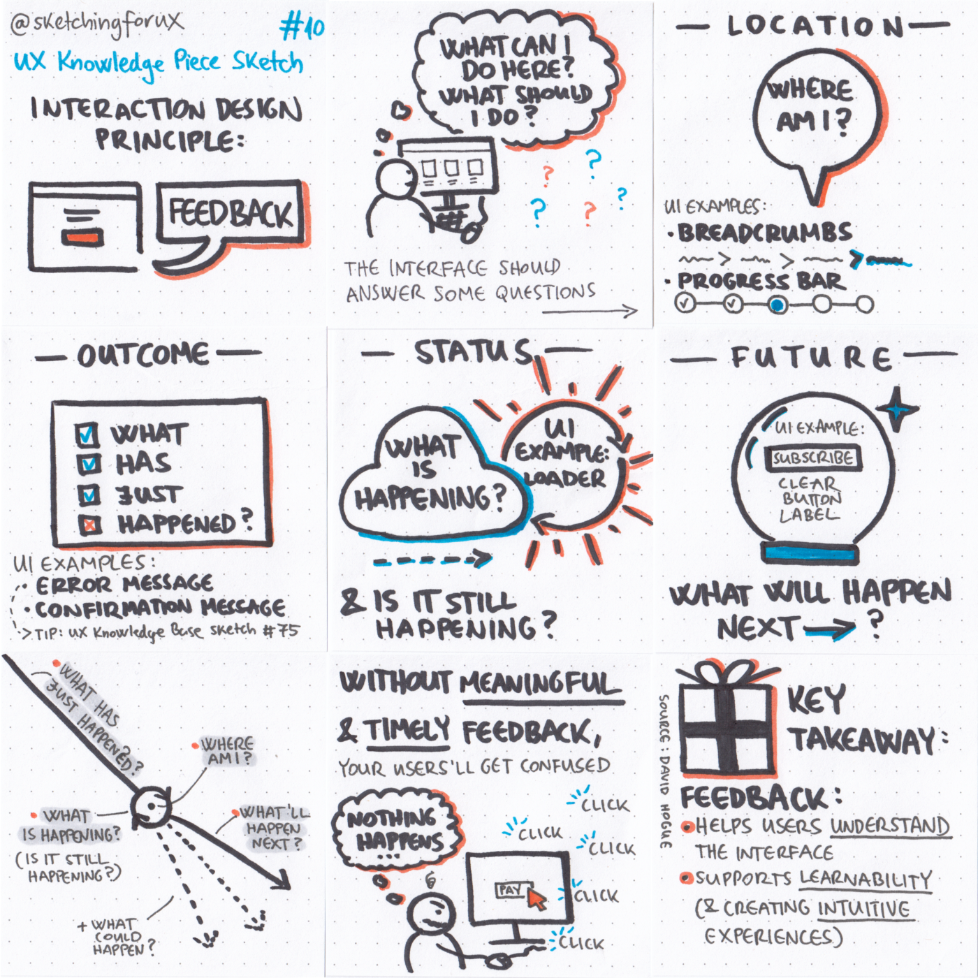 Sketch by Krisztina Szerovay