Icons
A good user experience can be defined in many ways, but one measure is the ability to reduce the user's effort to think.
Steve McCarthy
As with images, icons should serve a purpose and communicate meaning. In general, the most basic function of an icon is to convey information quickly. However, if the object, action, or idea is not immediately clear to users, the icon is useless.
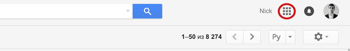
Take a look at the icons below. They are from Apple's mail client for OS X. How many of these do you think you can accurately identify?
Benefits
-
Fast recognition: A familiar or memorable icon may quickly convey meaning — sometimes more so than a text link.
-
Findability: When people learn what action is associated with a given icon, the icon's presence can provide an opportunity for some users to locate the command quickly and to become more efficient with repetitive tasks.
-
Good touch targets: Targets that include both a word and an icon are larger than targets that are just the word or just an icon. These larger targets are easier to click or tap on than smaller ones.
-
They save space: icons can be compact enough to allow toolbars, palettes, .ect to display many icons in a relatively small area.
-
Aesthtically pleasing: Icons can be visually pleasing and enhance the aesthetic appeal of a design.
Universal Icons
Finding a genuinely universal icon is rare. Icons for home, print, and search (magnifying glass) are in the minority.

There is no standard enforcing the use of icons, so eventually, many icons hurt the adoption of an icon over time, and therefore we have icons that serve many purposes.
| Icon | Multiple Meanings |
|---|---|
| favorite, save, add to wish list | |
| favorite, bookmark, rate | |
| add, edit | |
| comment, messages | |
| menu, list, grab | |
| repost, refresh, repeat | |
| share, back, undo, reply |
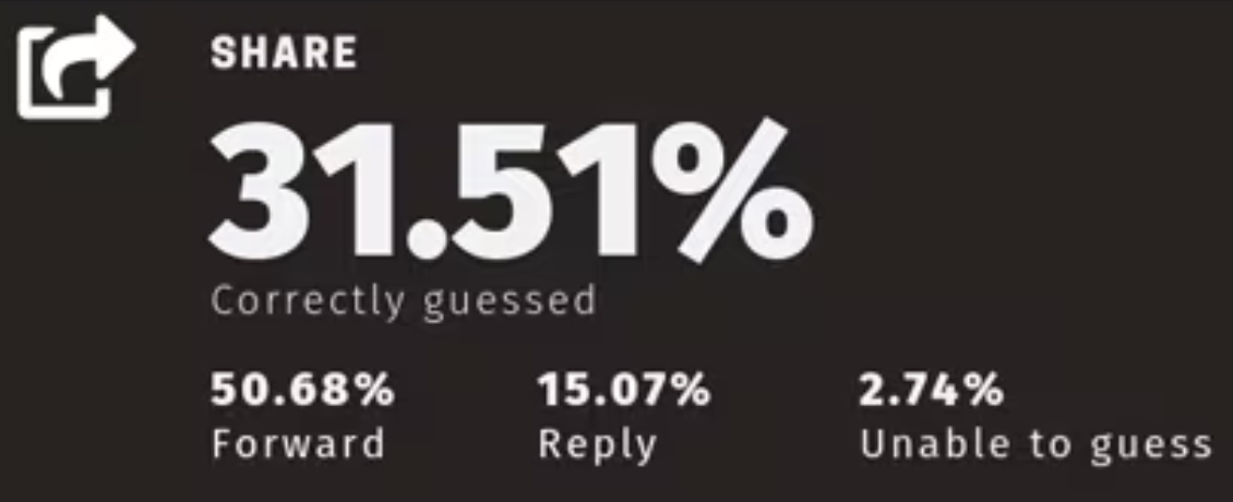
Some icons you believe are universal may not be fully recognized by everyone. Take the commonly used "share" icon. In a survey by 73 people only 32% successfully guessed the purpose of the share icon.
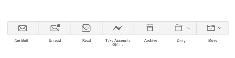
Google decided to simplify Gmail and hid functionality behind an abstract icon. Many users could not find their other apps, and Google heard many "Where's my Google Calendar?" complaints. Although this icon makes sense, it caused a lot of confusion for first-time users.
Labels
To help overcome the ambiguity that almost all icons face, a text label should be present alongside an icon to clarify its purpose. The label should be visible at all times (don't rely on hover).
Below the Swarm app uses a tooltip hint in an attempt to educate users. The is NOT how you should apply labels to icons.
A study found that:
-
Icons with labels: users were able to correctly predict what would happen when they tapped the icon 88% of the time.
-
Icons without labels: this number dropped to 60%.
-
Unlabeled icons that are unique to the app: users correctly predicted what would happen when they tapped the icon only 34% of the time.
Remember the Apple icons from their OSX email client. Here are those same icons with their labels. How many were you able to guess correctly?
Icon Sizes
I often see overly large icons in designs. For web use, stick to the standard sizes of 16, 24, 32, and 48. Notice they are multiples of 8; this is very common in web design.

Tips for Using Icons
-
First and foremost, icons should communicate meaning. The icon should be a visual representation of an object or action. This meaning should be clear to users.
-
Use the 5-second rule. If it takes you more than 5 seconds to think of an appropriate icon, it's unlikely an icon can effectively communicate that meaning.
-
Keep icons simple. Fancy and unique icons are not always bad, but they may have a negative impact on the user experience.
-
Always include a visible text label when it would help the user.
-
Icon labels should be visible at all times. Do not use a hover or tooltip to display a label.
-
Make icons appropriate sizes for the web (Approx 16-24 px tall)
-
Test the icons for recognizability. Ask people what they expect the icons to stand for.
-
Test the icons for memorability. Ask a repeat set of users if they can remember what the icon's meaning was.
Resources
Figma also has great plugins for icons. My go-to icon plugins are Icons8 and Iconify.