Wireframes
“Wireframes are the blueprint for design.”
— Chris Bank, The Guide to Wireframing
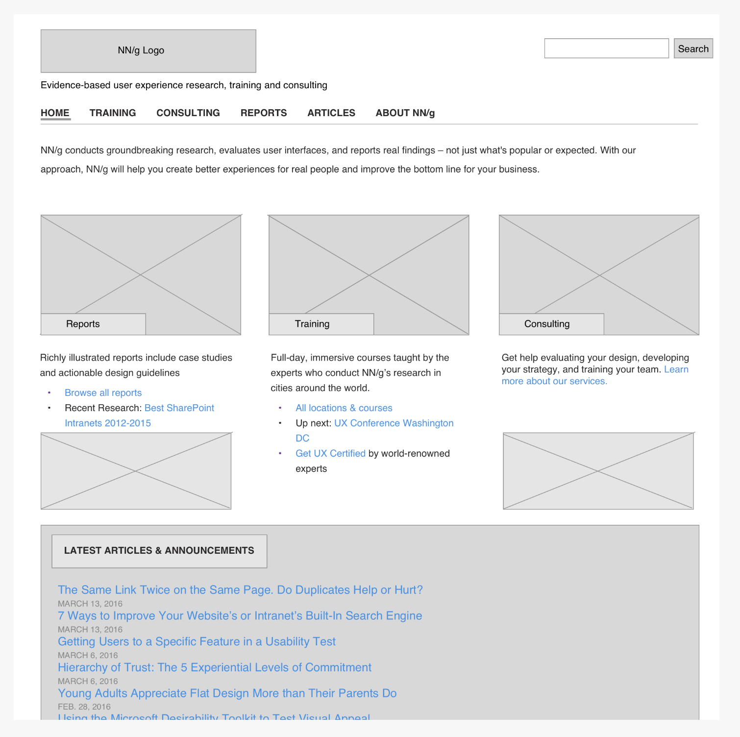
UX designers commonly use wireframes to show page-level layout ideas. They are rough sketches. They focus on space allocation and prioritization of content, functionalities available, and intended behaviors. They do not typically include any styling, color, or graphics; rather, they create the structure of your website layout. Consider wireframes as a refined "brain dump" of organizational ideas.
Purpose and value of wireframes
Wireframes are cheap, fast, and easy to change! It's often advised not to show wireframes to clients, as they typically are looking for something more polished. However, they are a necessary brainstorming tool to identify the following website components:
Structure – How will the pieces of this site be put together?
Content – What will be displayed on the site?
Informational hierarchy – How is this information organized and displayed?
Functionality – How will this interface work?
Behavior – How does it interact with the user? And how does it behave?
- Connects the site's hierarchy to its visual design by showing relationships and paths between pages
- Shows consistency in how information is displayed on the user interface
- Helps determine the prioritization of content by showing how much space is given to a particular element
Guidelines
- Wireframes come after the initial site map
- Keep them simple. Save the details for later.
- Do not use colors, typically wireframes and shown only in grayscale
- Do not use images. They distract from the purpose of the wireframe. To show where an image is located, a box is usually displayed with an "x" through it.
- Provide annotations. Notes can provide as a guideline when showing them to users or stakeholders.
- Use a generic font (up to two). Choosing a font is not part of the wireframing process; however, you can display different sized text to show the hierarchy of text information.
What to include
- Logo
- Search field
- Breadcrumb
- Headers, including the page title
- Body content
- Share buttons
- Contact information
- Footer
Other Design Documents
Mockups Mockups are the next level up from wireframes. They act as the skin to your design as they are more visual. They are where you solidify your visual decisions, which include color, images, and font choices. However, they are more than just turning the wireframe into color, they also aim to interpret the wireframe to fit the visual brand of the company. However, mockups do not usually show how an app or website will interact with a user. Mockups are usually shown to clients.
Prototypes A prototype is a representation of the final interaction between the user and the interface. It might not look exactly like the final product, but should be vastly similar. Prototypes are used to their full potential in user testing. Such as final interactions to check the usability of the interface, before the development begins. They are expensive and time-consuming to create, as they are often created in HTML and CSS.
| Document | Fidelity | Cost | Use | Traits |
|---|---|---|---|---|
| Wireframe | low | $ | Documentation, Quick, Communication | Sketchy, Grayscale, Representation of the interface |
| Mockup | middle to high | $$ | Gathering feedback and getting buy-in from stakeholders and users | Static visualization |
| Prototype | middle to high | $$$ | User testing, reusable backbone to the interface | Interactive |
Lorem Ipsum
Lorem Ipsem is placeholder text that designers commonly use to create a natural-looking block of text (sentence, paragraph, page, etc.) that doesn't distract from the layout. The original generator of lorem ipsum (somewhat Latin) text is provided below.
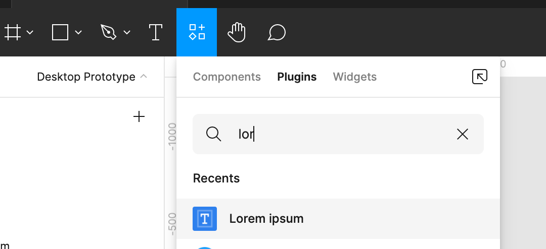
Figma also has a Lorem Ipsum generator. Go to the Resources icon in the main menu of a Figma Design document and search for Lorem Ipsum.
Wireframe Resources
Getting started with wireframing PDF: Includes 20+ wireframe examples from sketch to high-fidelity