Week 14 Coding Practice
Purpose
Practice creating responsive pages with media queries and floats.
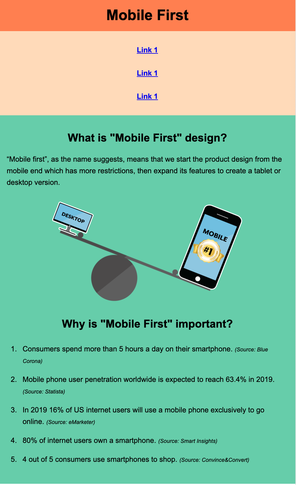
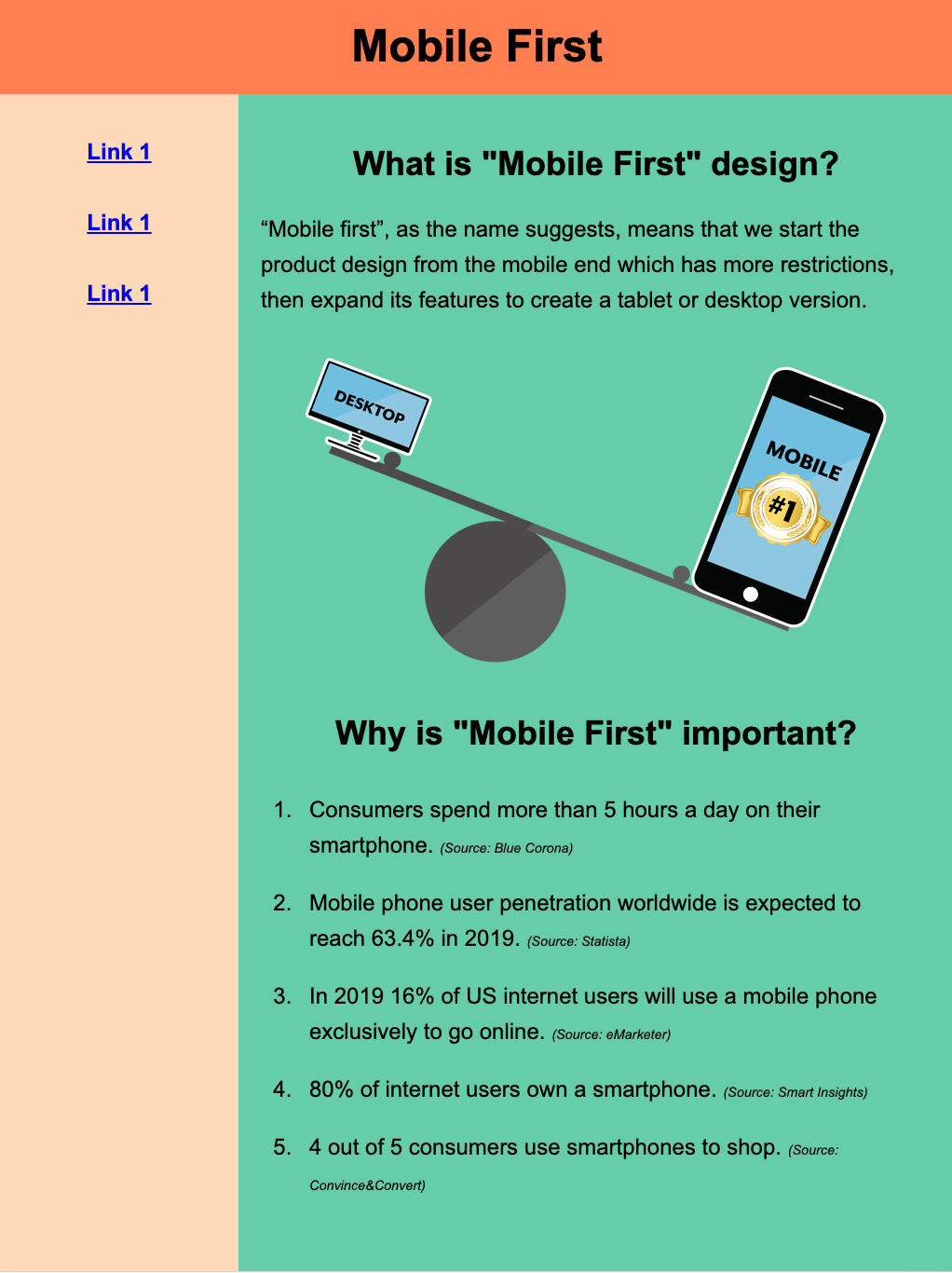
During the lecture and practice this week, we looked at using media queries to create styles for different viewports. We used a desktop-first approach because we started with a desktop viewport, then made mobile styles.
A mobile-first approach involves creating a base style for smaller devices first. Then you change your layout so it can be viewed on larger viewports (tablets and desktops).
Textbook Reference
- Chapter 17: Responsive Web Design (pages 485-488, 490-498)
Instructions
Directory Structure
- Download the practice14 and save it into your practice folder for this course.
- Open the webpage, index.html in VS Code, and the browser.
Create a Mobile Layout
Begin by having your browser window narrow to imitate a mobile screen. Or have the device toolbar open in your developer tools.
-
In the HTML document, set the viewport to match the same size as the screen
<meta name="viewport" content="width=device-width, initial-scale=1"> -
In your stylesheet, use the
*selector to select all elements on the HTML document and set thebox-sizingtoborder-box.When creating a mobile design, it's especially helpful to change the
box-sizingtoborder-box. We will be using percentages to fit our content to the viewport, therefore having the margin and padding included in our dimensions makes elements easier to size.* {box-sizing: border-box;}
Add Styles
Colors
- Give the
<header>a background color ofcoral. - Give the
<main>a background color ofpeachPuff. - Give the
<section>a background color ofmediumAquamarine.
Navigation Links
You should only be targeting only the navigation links
- Have them behave like block-level elements
- Have
1emof padding on the top and bottom - Bold the font
Responsive Image
- Fix the image, so it sizes appropriately to fit the viewport. Hint: use the
max-widthproperty
Mobile Layout
So far, we have an acceptable layout for a mobile device. Your website should look like the screenshot below.
However, when you widen the browser window, it would be nice to move the navigation element to the left side of the screen to make better use of the larger viewport.
Let's add a media query so that when we are viewing our website on a tablet or desktop, we see the navigation bar on the left side.
Add Media Query
-
Create a media query at the bottom of your stylesheet to target a screen with a
min-widthof40em.Don't forget to test!
Test to make sure the media query is working. Add a quick style, for example,
h1 {color: blue;}in the media query and test that it takes effect when the viewport is larger than640px. After you confirmed it works, remove the test style rule
The <nav> Element
Add the following styles for the <nav> element
- float left
- width of 25%
The <section> Element
Add the following styles for the <section> element
- float left
- width of 75%
The <main> Element
Notice, that our peachpuff color in our <main> element disappears?
This is because we floated all the elements inside the <main> element. The <main> element collapses because there is no content inside it giving it height.
To fix this, we must float our <main> element as well
- Add float: left to the
<main>element.
Sample Output
| Mobile View | Desktop View |
|---|---|
|
 |
HTML Validation
- Go to https://validator.w3.org/
- Click on the Validate by File Upload
- Click on the Choose file button and navigate to the location of your HTML document.
- Click the Check button
- Print it as a PDF and save it into a folder named validations in your practice14 folder
- Name the PDF indexValidation.pdf.
CSS Validation
- Go to https://jigsaw.w3.org/css-validator/
- Click on the by File Upload option
- Click on the Choose file button and navigate to the location of your CSS document.
- Click the Check button
- Print and save as a PDF and save the validation in a folder called validations in your practice14 folder
- Name the PDF cssValidation.pdf
Grading Criteria
- The correct file directory structure exists in the
practice14folder along with the HTML validation. - All course coding standards have been followed.
- The image is responsive to the viewport.
- The webpage has a mobile and desktop layout created with a media queries.
- Reflection questions are answered honestly and thoroughly.
Submission
Part 1: Reflection
- Locate the submission link for Practice 14 in Brightspace (Module 3 > Week 14 > Week 14 Coding Practice).
- Copy the below text (there is a copy icon in the upper-right of the textarea) and paste it into the Comments section.
- Answer the questions in the Brightspace.
1. How are you doing? Are you encountering any issues preventing you from completing this week's assignments? What can I do to better support you this week?


2. What did you find particularly insightful this week?


3. What part of the learning or coding process did you find most challenging? How did you overcome it?


4. What questions (if any) do you have about the material covered this week?
Part 2: Upload .zip
- Compress your entire practice14 folder to a .zip (zipped) file.
-
Do not zip the practice or Web Development folders. You should have the following files/folder in the zip file:
- images (folder)
- with images
- stylesheets (folder)
- index.css
- validations (folder)
- 1 HTML validation file
- 1 CSS validation file
- index.html
- images (folder)
-
Click on "Upload" to upload your .zip file or you can drag and drop it into the submission window.
- Click "Submit"