Week 14 Learn & Practice - RWD
Textbook
- Chapter 17: Responsive Web Design
- Why RWD - The Responsive Recipe (pages 485-488)
- Making Images Flexible - Choosing Breakpoints (pages 490-498)
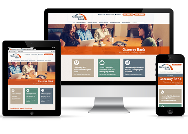
Responsive Web Design (RWD)
Responsive Web Design (RWD) is an approach to building a site that can be comfortably viewed and used on all manner of devices. All devices using the website use the same URL and HTML code, but different styles are applied based on the viewport size.
Three RWD Techniques
Instead of the layout being static, methods are implemented to have elements squeeze and flow into available space. We saw this happen when we used the CSS float property, but there are more advanced techniques that you will learn in the Advanced CSS course.
Flexible Grid
- Flexbox: https://www.w3schools.com/css/css3_flexbox.asp
- CSS Grid: https://www.w3schools.com/css/css_grid.asp
- Bootstrap: https://www.w3schools.com/bootstrap/default.asp
Flexible Images
Images and other media scale to fit their containing elements.
CSS Media Queries
Rules created in CSS that are only applied when a certain viewport size or orientation is used.
Flexible Images
- Download the week14Demo_rwd file and open it in VS Code and your browser.
- Notice that there is a large image that gets cut-off when we resize the viewport.
-
To make the image responsive is quite simple. Add the following code to the CSS document.
img {max-width: 100%;}Now, our image scales down to fix the width of their respective containers. However, it will never stretch to be larger than its original size. If you used width: 100%; the image would stretch to fill its container therefore becoming larger than its original size.
-
Give the
<article>elements the following styles.- a light background color
- width of 80%
- center the element
- center the text
- top and bottom margin
- rounded corners
Gradient Challenge!
Can you figure out how to apply a linear gradient to the background?
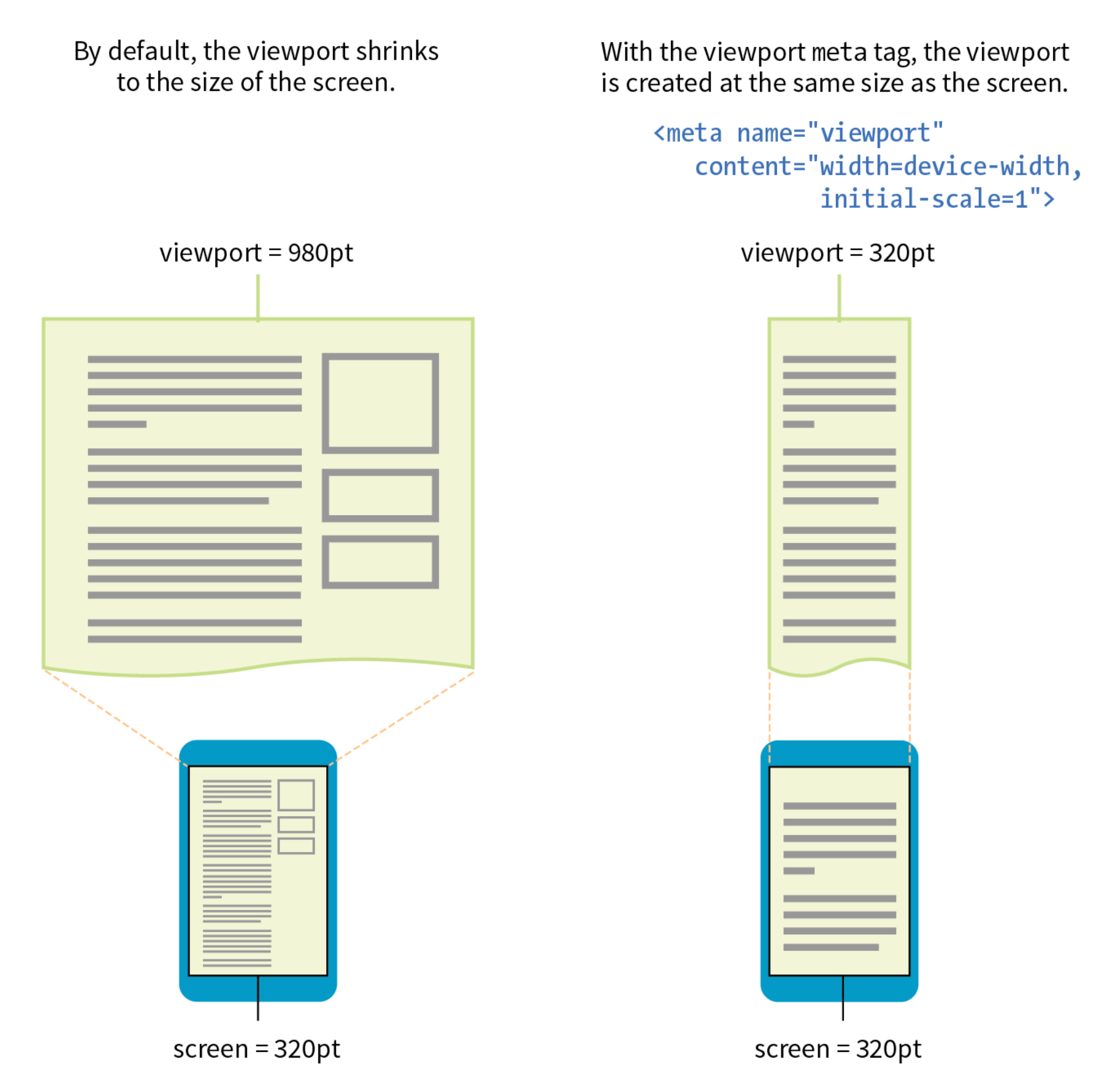
The Viewport
To fit websites onto smaller screen sizes, mobile browser will render the page on a canvas (viewport) then shrink that viewport down to fit the width of the screen (device width).
For example, on the iPhone the browser Safari renders the page as though the screen size was 980px. Then that rendering is shrunk to the size of the screen (320-414px).
- We can define the initial viewport size with the
<meta>element in our<head>section of our HTML document. - We can tell the browser to set the width of the viewport equal to the width of the device screen.
<meta name="viewport" content="width=device-width, initial-scale=1.0">
In the <meta> element:
- The
nameattribute’s value:viewportgives the browser instructions on how to control the page's dimensions and scaling.
- The
contentattributes 2 values:width=device-widthsets the page width to follow the screen-width of the device (which will vary depending on the device)initial-scale=1.0sets the initial zoom level when the browser first loads the page.
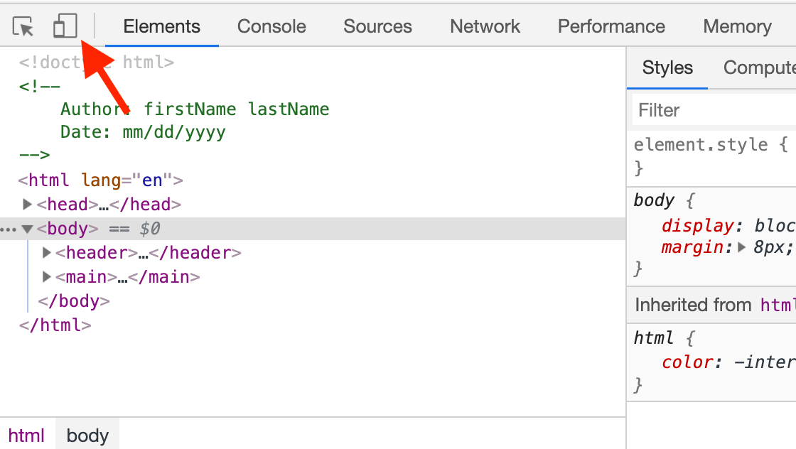
- Open your developer tools
-
Click on the "Toggle Device Toolbar"
-
Add the
<meta>element with the name and content attributes to the<head>section of the HTML and refresh your browser.<meta name="viewport" content="width=device-width, initial-scale=1.0">
Media Queries
Media queries display different styles based on the characteristics of the browser, such as its width, whether it is in portrait or landscape mode, its resolution, and more. We can even use media queries to change styles for printers.
-
In your CSS document, add a media query like the one below. This tells the browser to look for declarations in this media query when the screen is in landscape mode.
@media screen and (orientation: landscape) { } -
Inside the curly brackets, we can define style declarations to be applied only when the viewport is horizontal. Add the following background-color or some of your own styling.
@media screen and (orientation: landscape) {
    body {background-color: #012033;}
    h1 {color: #d68a66;}
}
Nested Curly Brackets
Notice that media queries require us to nest curly brackets! This is where correct indentation is helpful in preventing errors.
-
Create another media query to change the background-color for when the orientation is in portrait mode.
-
We can add media queries when the user prints a webpage. Add a new media query for print styles.
@media print {
    h1 {color: deepSkyBlue;}
}
Breakpoints
In the above demo, we saw that we could test the browser for a particular feature in our media query. For example, we tested if the browser was in landscape or portrait orientation. We can also test additional features (page 493 of your textbook). The most common is testing for the viewport size with min-width and max-width.
-
Add a media query to test for
max-widthof600px.@media screen and (max-width: 600px) { body {font-family: 'Lobster', cursive;} }- When the viewport is smaller or equal to
600px, the font changes to be cursive. If it is larger than600px, it loses the cursive font. - We introduced a style change at the
600pxviewport size. This is called a breakpoint. By creating multiple media queries for different breakpoints, we can control how our website looks on different mobile devices. - This can become overwhelming as there are many different devices with different widths. W3Schools has provided media queries for common breakpoints.
- Our breakpoint is currently set for most small mobile devices.
- When the viewport is smaller or equal to
Fix the Navigation
You may have noticed; our navigation menu does not work well unless the user has a wide viewport. By slowing scaling down the size of the browser window, you can find the pixel (px) size at which the navigation no longer fits. I found that around 1200px our navigation breaks.
- Set up a media query for a
max-widthof1200px - Create a style rule for the navigation links.
- Using the
displayproperty, have the<a>elements behave like a block-level element. -
Add any additional styling you want. I also removed the border and created a linear gradient (with transparency) for an added effect.
@media screen and (max-width: 1200px) {
    nav a {
        display: block;
        border: none;
        background-image: linear-gradient(rgba(255, 255, 255, .1), #546E7A);
    }
}
The order matters!
When using media queries, the order is very important. Styles applied last in the stylesheet override the rules that come before them. Therefore, your styles need to come after any rules with the same declaration. Typically, you would declare styles for small screens first and then introduce styles for increasingly larger screens later in the stylesheet.