Week 11 Learn & Practice - Floats & Positioning
Textbook
- Chapter 15: Floating and Positioning
- Floats: pages 387-398
- Positioning: 405-416
Everything in our HTML document thus far has followed the "normal flow" in the CSS layout model. Normal flow means elements appear in the browser in the same order they are written in the source code.
- Block elements stack up on top of each other and fill the width of the browser window (or containing element).
-
Inline elements line up next to one another to fill the content they contain.
Images are Inline Elements
It's important to note that although images appear to be block-level elements because they have a width and height, they are inline elements.
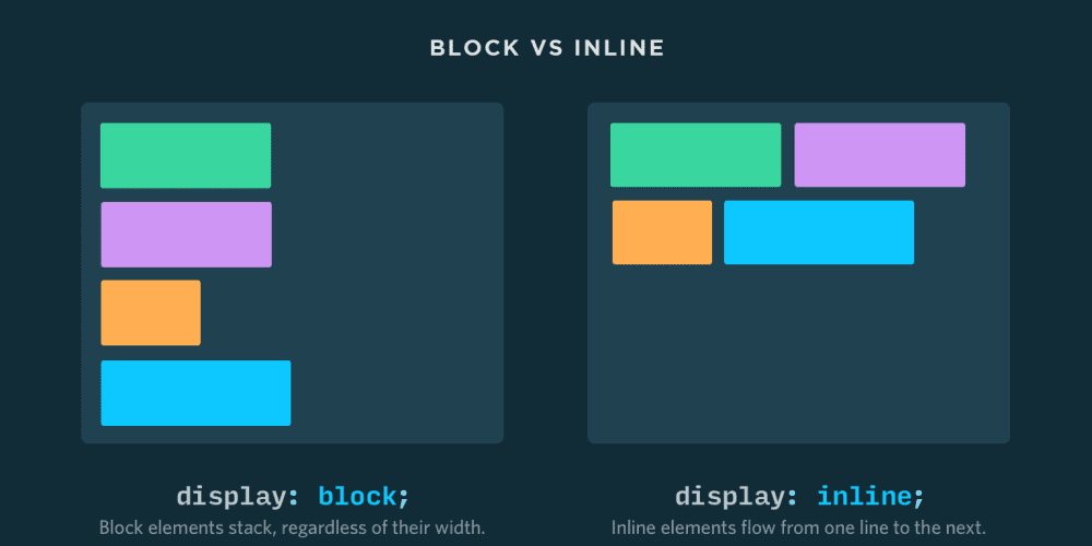
Image source: Nilead
Floating Elements
Floating an element moves it to the left or right and allows the following text to wrap around it.
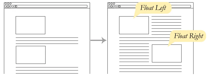
Image Source: Girl Develop It: Intermediate HTML + CSS
-
Download week11Demo_positioning and open the website up in VS Code and the browser. The
<header>and<footer>have a background color to make the block-element visible. The<main>element has a border. -
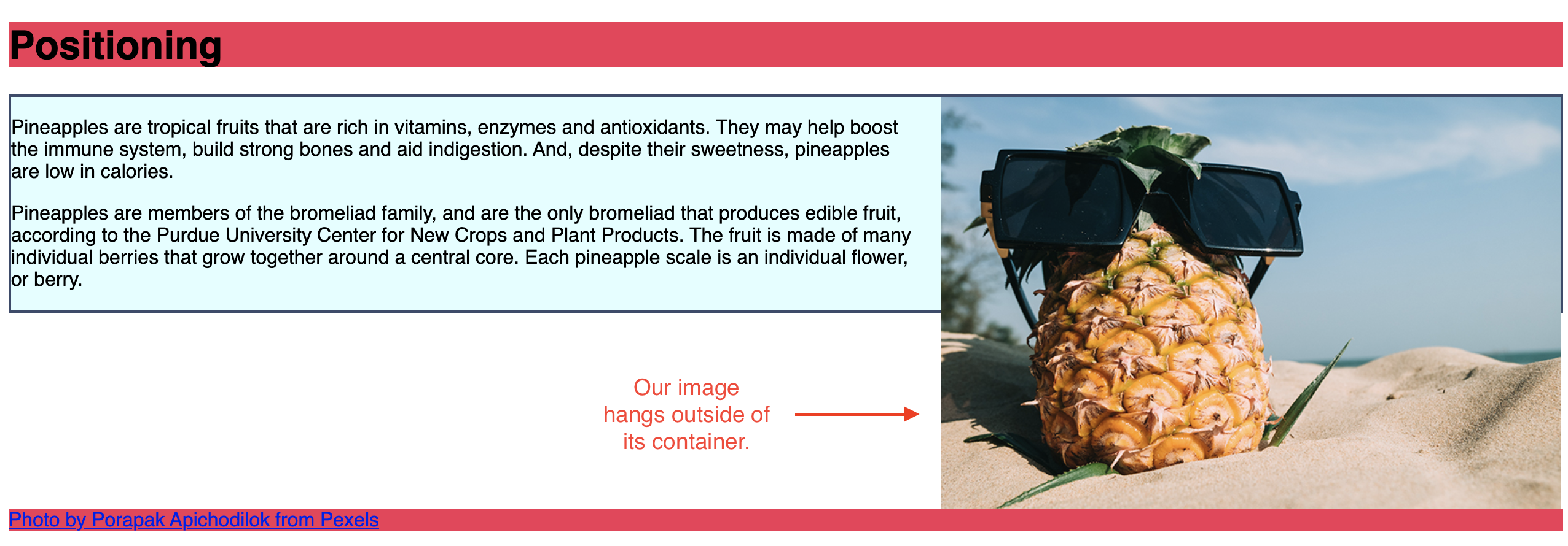
Our photo is rather large at this point, adjust this by adding a CSS width property.
img {width: 40%;} -
Resize the browsers window. Notice that because we provided a percentage measurement, it scales with the browser size. The image will always remain 40% of its containing element, in this case, the
<main>element. -
We have a lot of wasted space to the right of the image. Using the
floatproperty, we can make the text wrap around the image.img { width: 40%; float: left; }The float property takes the element out of the normal flow. In this case, we forced it to the left.
-
Change the CSS rule to float to the right
img {
    width: 40%;
    float: right;
}
When we float an element, everything in the source code under the element attempts to float around it.
Notice that the
<footer>and the<main>element are behind the image. -
The text in the
<main>element has crowed around the image. Add amargin-leftto fix this.img { width: 40%; float: left; margin-left: 1em; }
Clearing a Float
We don't want the footer to wrap around the image. We need to turn the wrapping off and get back to the normal flow when we get to the footer element.
We accomplish this with the clear property.
-
Add a style rule for the footer and apply the property/value of
clear: right;footer {clear: right;}Now, the footer has stopped wrapping and resumed its normal position.
-
To clear a float to the left, you use
clear: left; - To clear a float to the right, you use
clear: right; - You can clear a left and right float with the value of
clear: both;
Containing Floats
Our container element (the <main>) has shrunk in height (it's shorter than our image). By default, floats are designed to hang out of the element they are contained in.
Since the floated element is outside of the normal flow, the container (the <main> in our example) is only as tall as the un-floated content.
-
Add a float to the left to the <
main>element.main { border: 2px solid #3b4a6b; background-color: lightcyan; float: left; }
Steps to Float an Image
- Provide a width for the floated element
- Float element to either the left or right
- Provide a margin, so wrapping text does not crowd the floated element
Play with Floats
Click on the "EDIT ON CODEPEN" logo in the upper-right to go to the Codepen website.
See the Pen CSS Floats Playground by Gil David (@GilDavid) on CodePen.
Positioning
- Positioning elements is a way to specify the location of an element anywhere on the page with pixel precision.
- Your textbook uses the term viewport to refer to the browser window. The viewport is the space that visually displays a web page.
- To position an element on the page, you use the
positionproperty.

Static Positioning
-
After the first paragraph in the
<main>element, add the image pineappleSlices.png and give it anid.<main> <img src="images/pineapple.jpg" alt="Pineapple with sunglasses"> <p>Pineapples are tropical fruits that are rich in vitamins, enzymes and antioxidants. They may help boost the immune system, build strong bones and aid indigestion. And, despite their sweetness, pineapples are low in calories.</p> <img src="images/pineappleSlices.png" alt="Pineapple Slices" id="slices"> <p>Pineapples are members of the bromeliad family, and are the only bromeliad that produces edible fruit, according to the Purdue University Center for New Crops and Plant Products. The fruit is made of many individual berries that grow together around a central core. Each pineapple scale is an individual flower, or berry.</p> </main>Notice the new image is inheriting the styles of the other image; therefore, it is also floating to the right.
-
Add a style for this image to give it a width and remove the floating behavior with
float: none;. -
Also, apply a
borderso we can see the element's boundaries.img#slices { width: 20%; float:none; border: 1px solid brown; }By default, when the element is in the "normal flow" the position is considered static.
We could provide a CSS property/value of
position: static;but this would not change anything since the element is already in the normal flow.
Relative Positioning
Relative positioning moves an element relative to its original spot in the flow. What it means is "relative to itself". The space it would have occupied is preserved and continues to influence the layout of surrounding elements.
-
Give the new image the style of
position: relative;img#slices { width: 20%; float:none; border: 1px solid brown; position: relative; }This alone changes nothing on the page, but now we can move the element relative to its original position with the off-set properties:
top,bottom,right, andleftproperties. -
Play with moving the element around with the off-set properties.
img#slices { width: 20%; float:none; border: 1px solid brown; position: relative; left: 2em; top: 5em; }left: moves an element to the rightright: moves an element to the lefttop: moves an element down-
bottom: moves an element up -
With relative positioning, the original space in the document is preserved, and overlapping can occur, as seen in the example.
Absolute Positioning
Absolute positioning lets you place an element exactly where you want it on the page. It’s taken out of the normal layout, so it doesn’t push other elements around or take up space. It’s positioned based on the closest parent that has positioning (like relative or absolute). If there’s no such parent, it goes by the browser window instead.
-
Comment out the relative positioning and the off-set properties to have our image go back to the normal flow.
-
Add the style rule
position: absolute.- Notice the space it once took up is now removed on the page.
- It has been positioned relative to its containing block element, in our case, the
<main>element.
-
Add some off-set properties to move the element around.
img#slices {
    width: 20%;
    float:none;
    border: 1px solid brown;
    /*position: relative;
    left: 2em;
    top: 5em;*/
    position: absolute;
    top: 5em;
    left: 5em;
}
This time, the off-set properties moved the element from the containing element, not its original position.
Staking Order
By default, we've learned that element stack on top of each other based on the order they appear in the source code. However, we've now seen that overlapping can happen when we change how elements are positioned.
The property z-index can change how elements are stacked. It can take a positive or negative number.
-
Set the
leftoffset property so that it overlaps the pineapple slices and the image of the pineapple wearing sunglasses. -
Add
z-index: -1;to the pineapple slices image.-
The negative number moved the image to the bottom of the stack, and now the
<main>element (which contains the<p>elements, and the<img>element) are on top. -
The
z-indexdoes not work on elements that are statically positioned elements (the default positioning of all elements)
-
-
Comment out the first image. You can see the pineapple slices are still hidden under the
<main>element. -
Changing the
z-indexto1will move it back to the top of the stack
 Feeling Confused - Don't Worry!
Relative, absolute, and the stacking order are complex topics, and even the most experienced web developers get confused. Mastery comes with lots of PRACTICE!