Week 8 Learn & Practice - Box Model
Textbook
- Chapter 14: Thinking Inside the Box
The Box Model
The Box Model is a fundamental concept of CSS. Every element (inline and block) in a document generates a box to which properties such as width, height, padding, borders, and margins can be applied.
All elements have these properties; however, you will see that they behave differently depending on if they are block-level or inline elements. The entire box shown below is what takes up space (width and height) in the browser.
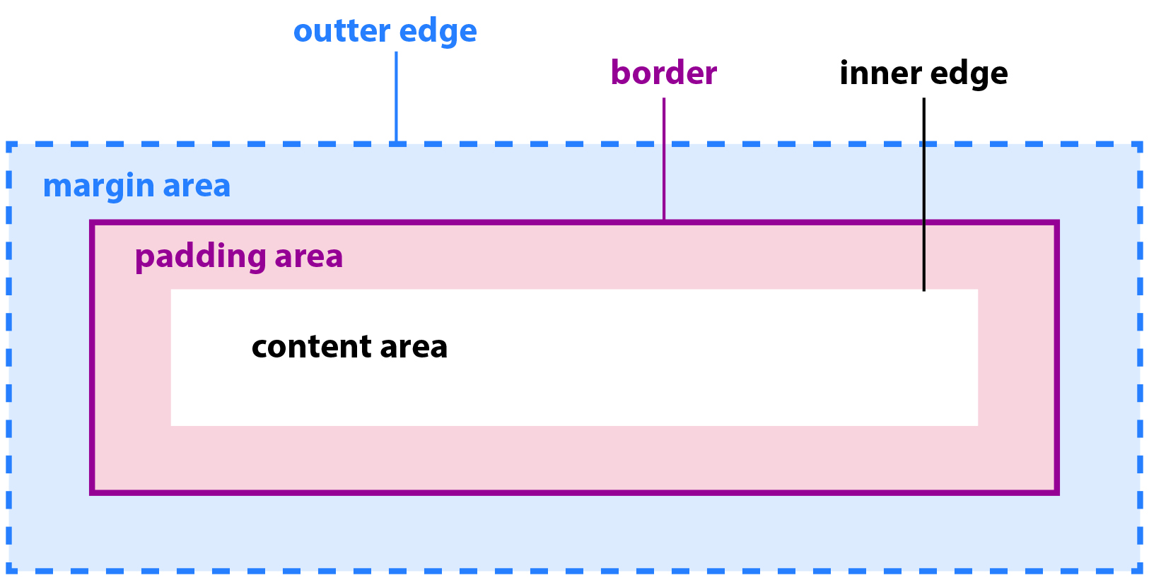
| Area | Description |
|---|---|
| Content | Core of the element box. |
| Inner edge | Edge of the content, invisible in the browser. |
| Padding | Space between the content and an optional border. |
| Border | Line or stylized line surround the content and its border. |
| Margin | Optional amount of space added outside of the border. The margin always renders transparent. |
| Outer edge | Edge of the margin, invisible in the browser. |
The browser's user agent stylesheet already applies some of the box-model properties to the page.
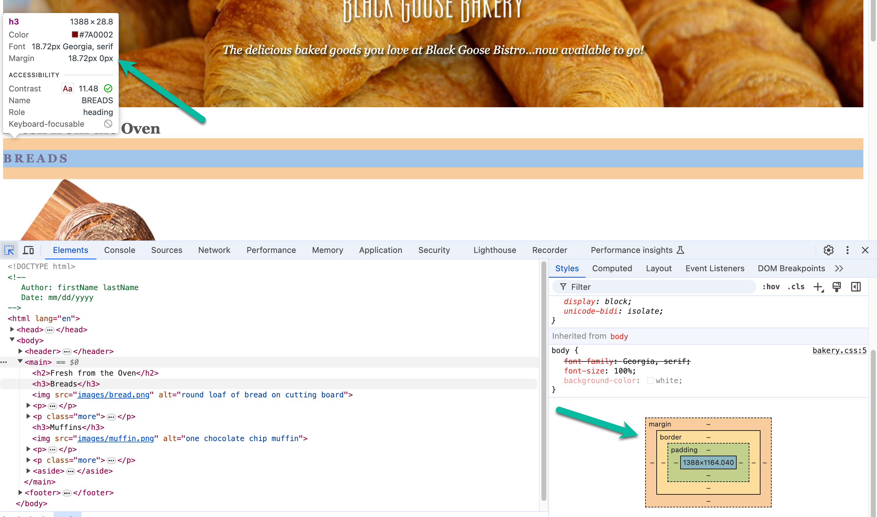
Inspect Default Styles
-
Download the week08Demo_boxModel file and open the website in VS Code and your Browser.
-
Open the developer tools (F12) and inspect the element which holds the "BREADS" heading.
- Hovering over the BREADS heading shows the margin in light orange
- A pop-up box also indicates the margin displayed in pixels
- Clicking on the element and scrolling down to view the bottom of the Styles Tab shows a visual diagram of the element's box model.
-
Inspect more elements on the page. Can you find more default box model styles applied to any elements?
-
Since the default margins can become a hindrance for many developers, you will often see the margins reset to zero, but this is not required.
body {margin: 0;}
Box Dimensions
By default, the browser calculates the width of an element by the content. However, the space the element takes up on the page includes the margin, border, and padding.
These measurements can make sizing elements difficult, so many developers chose to apply a box-sizing: border-box property/value pair to the html element. This property sets the width measurement to be determined by the entire box-model and not just the content.
html {box-sizing: border-box;}
The box-sizing: border-box property/value pair does not automatically cascade or inherit to all the elements on the page. To fix this, use the universal selector, as demonstrated below.
The * is the universal selector. It selects every element on the HTML document.
* {box-sizing: inherit;}
Padding
Padding is the space between the content area and the optional border. Padding is extremely useful in giving your content "breathing-room". In previous demos and exercises, we've seen text crowded against the edge; now, we can fix this.
You can add padding to both block-level and inline elements.
Below, padding is specified for each side of the element's box.
padding-top: 1em;
padding-right: 1.5em;
padding-bottom: 1em;
padding-left: 1.5em;
Padding Shortcut
Most often used, is the shortcut. The padding property can take 4 values in this order: top right bottom left
/*
    top = 1em
    right = 1.5em
    bottom = 1em
    left = 1.5em
*/
padding: 1em 1.5em 1em 1.5em;

/* top, right, bottom, left */
/*
    top & bottom = 1.5em
    right & left = 1em
*/
padding: 1.5em 1em;

/* top & bottom, right & left*/
And if ALL the sides need the same amount of padding, you can just specify that amount once.
/*
    All sides have 1em padding
*/
padding: 1em;
Always use the shortcut properties when you can!
-
Add some top and bottom padding to the
<nav>and<footer>elements. I have started a style rule for you, just add the below padding.Applying a zero margin, padding, or border
When you apply 0 you don't need to specify the unit of measurement.
padding: 1.5em 0; -
Add padding around all the sides of the
<aside>element, so the text doesn't appear squished on the left-side. The below style would apply 1.5em of padding to the top and bottom and 2.5em of padding to the right and left.padding: 1.5em 2.5em; -
Add padding around the
<main>element.
Borders
- Borders are optional and, when used, appear around the padding of an element.
- You can specify the width of the border, style, and color.
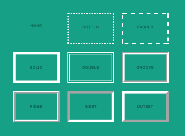
Border Styles
They come in 8 different styles, shown below. Each side can have a different style, although not commonly done.
border-top-style: solid;
border-right-style: dashed;
border-bottom-style: ridge;
border-left-style: double;
or all at once, following the top, right, bottom, left order
border-style: solid dashed ridge double;
Border Width
Once again, you can target each side of the box individually to set the thickness of the border.
border-top-width: .5em;
border-right-width: .2em;
border-bottom-width: .5em;
border-left-width: .2em;
Or combine the top/bottom and right/left if they are the same (as we did with padding).
border-width: .5em .2em;
Border Color
This should start to look familiar:
border-top-color: blue;
border-right-color: pink;
border-bottom-color: orange;
border-left-color: purple;
or
border-color: blue pink orange purple;
Border Shortcut
Usually, we don't style borders with all different colors, styles, or widths. Thankfully, we have a shortcut property, border that can take a width, style, and color (and it doesn’t need to be in that order).
-
Add a border around the
<main>element. Again, the<main>element already has a style rule started in the stylesheet. -
Add a bottom border to the
<h3>elementsborder: 4px double #EADDC4; -
Add a dashed bottom border to the links contained in the
<main>element when the user hovers over them. You will need to create a new style rule for this.border-bottom: 2px dashed;Where is the color coming from?
Why don't you need to specify a color?
-
Add a little bottom
paddingon the same links you just styled to move the dashed border down a bit.
Rounded Borders
You can make the border corners rounded with the border-radius property.
border-top-left-radius: 1em;
border-top-right-radius: 2em;
border-bottom-right-radius: .5em;
border-bottom-left-radius: .7em;
or round them all corners the same
border-radius: 1em;
- Round the
<main>element's borders. - Round the top-right and top-left borders of the
<aside>element.
Margins
The margin is the optional amount of space that you can add on the outside of the border. We saw how the browser's user agent stylesheet automatically adds margins on some elements.
Like the padding property, you can add margins to each side individually or use the shortcuts.
margin-top: 2em;
margin-bottom: 1.5em;
margin-right: .5em;
margin-left: 1em;
Specify top/bottom (1em) and right/left (2em) together.
margin: 1em 2em;
Specify all sides (1em) together.
margin: 1em;
-
Add a margin around the
<main>element.margin: 2em; -
Remove the default margin around our
<body>element if you have not already done so.margin: 0;
The display Property
We already know that elements are either block-level or inline elements. However, we can change the element type by using the display property.
- Look at the navigation links. They appear on one line because of the
<a>element is an inline element. We could add<br>elements after each anchor element to force them to a new line, or we can change the<a>element to behave like a block-level element. Add the below code to your style sheet.
nav a {display: block;}
<br> or display: block;
Why might using a display: block; on the <a> elements be a better solution than using <br> elements?
The box-shadow Property
Just like text, you can apply a drop shadow to the visible elements of the box (including the margin). It takes the same property values as the text-shadow property.
- Add a
box-shadowto the<header>element styles.
header {box-shadow: 0 .2em .5em gray;}