Week 10 Learn & Practice - Forms
Textbook
- Chapter 9: Forms
Radio Buttons
Use radio buttons when you need the user to select ONE option.
You create a radio button with the <input type="radio"> element and attribute.
Each radio button must have the same name attribute.
-
Open the week10Demo_forms website.
-
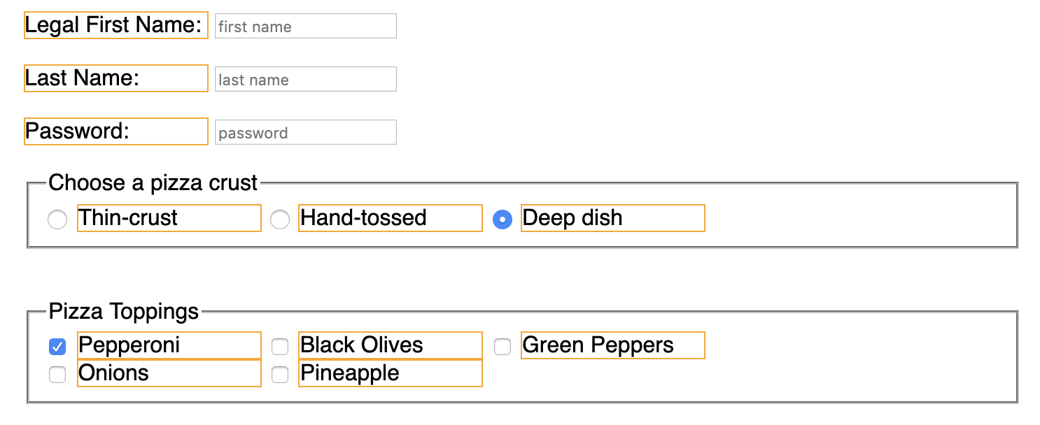
Add three radio buttons to our form for the user to choose the type of crust they want on their pizza. Place this before the
<textarea>element.<input type="radio"> <input type="radio"> <input type="radio"> <br><br>You should see three circles on your form. However, we need some labels to identify each radio button.
-
Add
<label>elements after the radio button.<input type="radio"> <label>Thin-crust<label> <input type="radio"> <label>Hand-tossed<label> <input type="radio"> <label>Deep dish<label> -
Add the
idandforattribute to tie the label to the correct input.<input type="radio" id="thin"> <label for="thin">Thin-crust<label> <input type="radio" id="hand"> <label for="hand">Hand-tossed<label> <input type="radio" id="deep"> <label for="deep">Deep dish<label> -
We still don't have anything going to the server. We need to add a
valueattribute to each radio input. And then anameattribute<input type="radio" id="thin" value="thin"> <label for="thin">Thin-crust<label> <input type="radio" id="hand" value="hand"> <label for="hand">Hand-tossed<label> <input type="radio" id="deep" value="deep"> <label for="deep">Deep dish<label>We can still select more than one radio button. We need to fix this next.
The magic behind getting radio buttons to work is assigning the same name attribute to each radio field. Remember, this is how our data is getting to the server.
-
Add the
nameattribute with the same value to each<input>element.<input type="radio" id="thin" value="thin" name="crust"> <label for="thin">Thin-crust<label> <input type="radio" id="hand" value="hand" name="crust"> <label for="hand">Hand-tossed<label> <input type="radio" id="deep" value="deep" name="crust"> <label for="deep">Deep dish<label>The
nameattribute carries thevalueover to the server.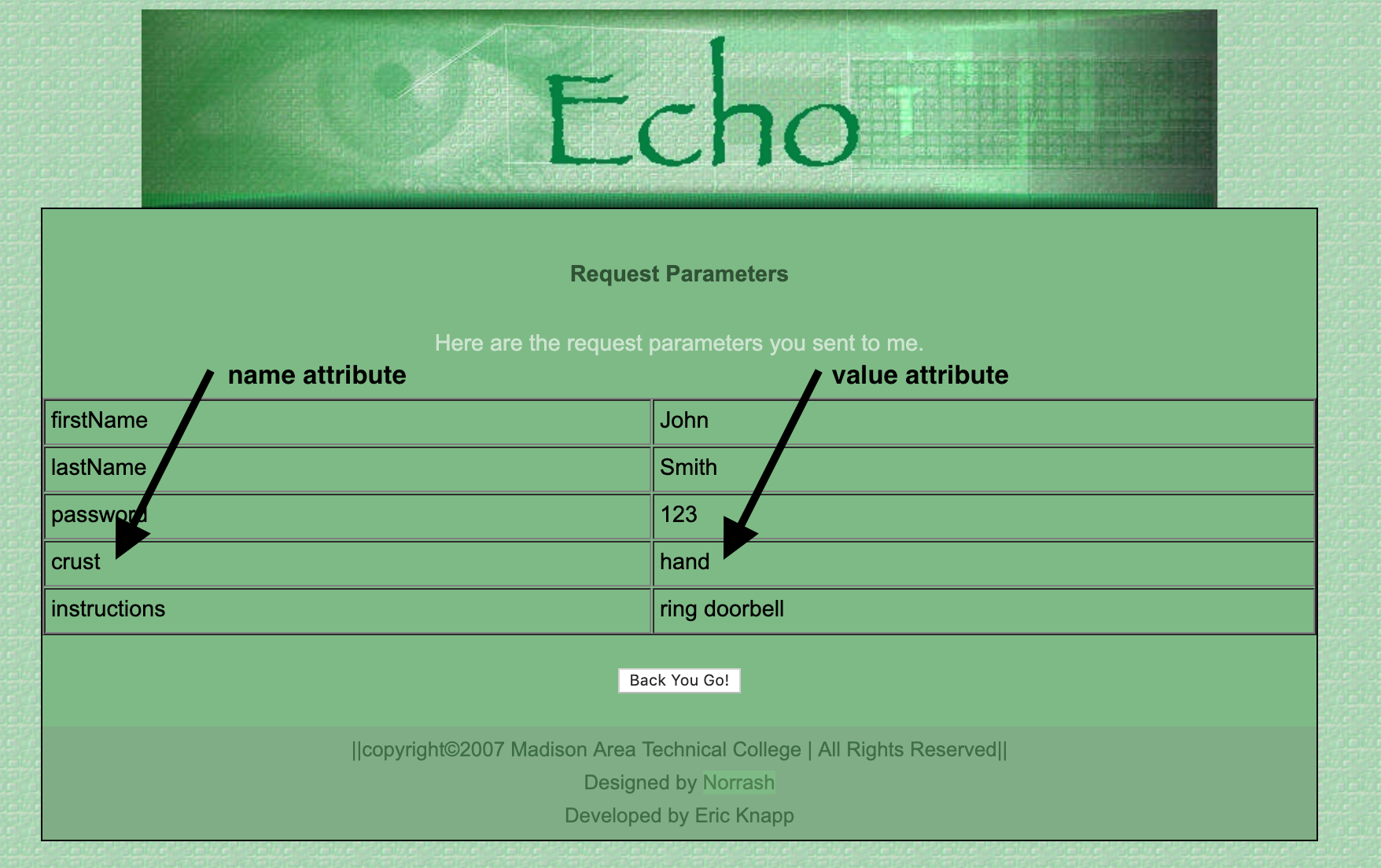
The <fieldset> & <legend> Elements
Because our radio buttons are a group of elements, it's important to use the appropriate semantic element to indicate they belong together.
Use the <fieldset> element to group related form elements.
The <legend> element provides a title for the grouped elements.
- Wrap our radio buttons in the
<fieldset>element. Notice that the browser styles this in a gray border by default. -
Add the
<legend>element as the first child in the<fieldset>. Give it the content: Choose a pizza crust.<fieldset> <legend>Choose a pizza crust</legend> <input type="radio" id="thin" value="thin" name="crust"> <label for="thin">Thin-crust<label> <input type="radio" id="hand" value="hand" name="crust"> <label for="hand">Hand-tossed<label> <input type="radio" id="deep" value="deep" name="crust"> <label for="deep">Deep dish<label> </fieldset>
Checkboxes
Checkboxes are like radio buttons, but they allow the user to select more than one choice. Therefore, we need a different value for each name attribute.
You create a checkbox with the <input type="checkbox"> element and attribute.
Each checkbox must have a different name attribute.
-
After the radio buttons, add five checkboxes.
<input type="checkbox"> <input type="checkbox"> <input type="checkbox"> <input type="checkbox"> <input type="checkbox"> -
Provide the following labels for each checkbox for pizza toppings. Use the
forandidattributes to tie the label to the input element.<input type="checkbox" id="pepperoni"> <label for="pepperoni">Pepperoni</label> <input type="checkbox" id="olives"> <label for="olives">Black Olives</label> <input type="checkbox" id="pepper"> <label for="pepper">Green Peppers</label> <input type="checkbox" id="onion"> <label for="onion">Onions</label> <input type="checkbox" id="pineapple"> <label for="pineapple">Pineapple</label> -
Add the
nameandvalueattributes. Each checkbox needs a differentnameattribute value. Otherwise, only the first checkbox selected will go to the server.<input type="checkbox" id="pepperoni" name="pepperoni" value="pepperoni"> <label for="pepperoni">Pepperoni</label> <input type="checkbox" id="olives" name="olives" value="olives"> <label for="olives">Black Olives</label> <input type="checkbox" id="pepper" name="pepper" value="pepper"> <label for="pepper">Green Peppers</label> <input type="checkbox" id="onion" name="onion" value="onion"> <label for="onion">Onions</label> <input type="checkbox" id="pineapple" name="pineapple" value="pineapple"> <label for="pineapple">Pineapple</label>In this case, both the
nameandvalueattributes are the same, which is fine. Often, developers will use codes for the values.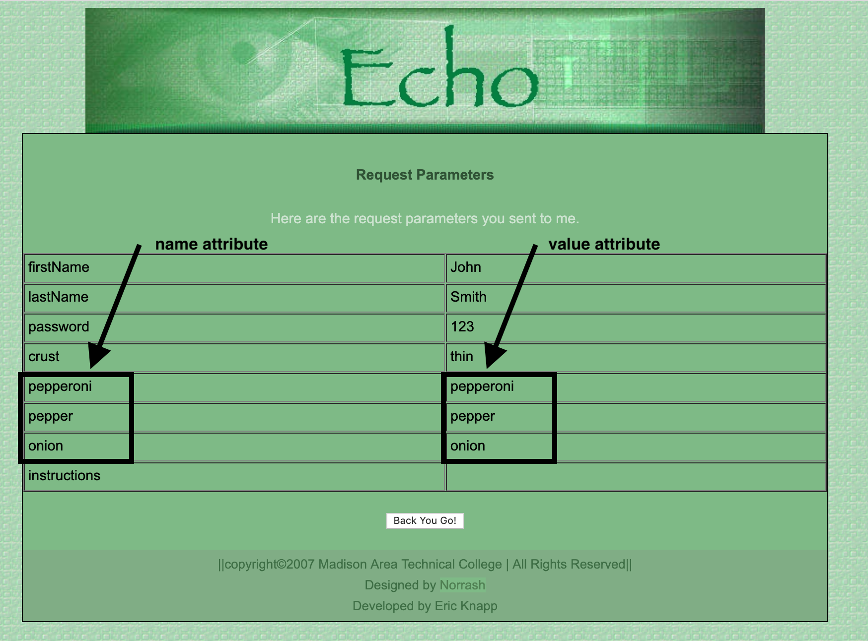
The checked Attribute
You can choose a radio button or checkbox to be selected by default with the checked attribute. Like the required attribute, it does not need a value.
-
Have the radio button choice of "Deep dish" selected by default.
<input type="radio" id="deep" value="deep" name="crust" checked> <label for="Deep">Deep dish<label> -
Have the checkbox "Pepperoni" selected by default.
<input type="checkbox" id="pepperoni" name="pepperoni" value="pepperoni" checked>
<label for="pepperoni">Pepperoni</label>
Dropdown <select> Menus
The last type of form field we will be looking at is the dropdown or select menu. You create a dropdown menu with the <select> element.
Nested inside the <select> element is several <option> elements, which hold the menu choices.
-
Under the Pizza Topping, add a dropdown for Payment Type. Don't forget to provide a
<label>.<label for="payment">Payment Type</label> <select id="payment"> <option>Cash</option> <option>Check</option> <option>Credit</option> </select> -
Just like checkboxes and radio buttons, we need a
nameandvalueattribute. Thenameattribute goes in the<select>element. Thevalueattribute is in every<option>element.<label for="payment">Payment Type</label> <select id="payment" name="payment"> <option value="cash">Cash</option> <option value="check">Check</option> <option value="credit">Credit</option> </select>If no
valueattribute is in the<option>element, the content within the<option>element goes to the server. Although this works, it's best to provide avalueattribute. This is because the<option>content could contain special characters and spaces, which could make processing on the server more difficult.
Styling Forms
By default, forms don't look very stylish. Understanding which elements are inline and block-level will help understand how best to style a form.
Centering the form
-
Place a
borderaround the form element. Since this is a block-level element, it expands the full width of its container.form {border: 4px solid #630c15;} -
Give the form a
widthof about50%form { border: 4px solid #630c15; width: 50%; } -
To center a block-level element, we use the
margin: 0 auto;property/value pair to apply an equal margin to the right and left.form { border: 4px solid #630c15; width: 50%; margin: 0 auto; /* margin shortcut: top/bottom right/left */ } -
Add some
paddingaround the form.form { border: 4px solid #630c15; width: 50%; margin: 0 auto; padding: 2em; }
Placement of Labels
Labels for most fields are positioned immediately before the field, that is, for left-to-right languages, either to the left of the field or above it, and for right-to-left languages, to the right of the field or above it.
Labels for radio buttons and checkboxes are positioned after the field.
Aligning Text Boxes
There are many options when it comes to arranging your input boxes. I will show you two popular ways of aligning text boxes, so they are readable. Legibility is important when it comes to forms, so your user doesn't make errors when filling out the form.
The <label> and the <input> element are both inline elements, so they don't automatically go on their own line. However, remember the display CSS property? We can change this behavior on any element!
Option 1: Input on their own line
-
Add the
display: blockto the<input>element.input {display: block;}This makes each
<input>element go on its own line. However, this doesn't look good for our radio buttons and checkboxes. We can use the attribute selector to target just the<input>elements that are fortype="text" -
Change the previous rule to use the attribute selector to target
<input>element that are fortype="text",type="password", and the<textarea>element. Use a grouped selector:input[type="text"], input[type="password"], textarea {display: block;} -
If you wish, we can increase the
widthof these elements as well now that they are behaving as block-level elements.input[type="text"], input[type="password"], textarea { display: block; width: 100%; } -
Add some
heightto the<textarea>element, so it more accurately represents an area where more text is entered.textarea {height: 150px;}
Option 2: Labels with fixed width
-
Comment out the following styles we just created.
/*
input[type="text"], input[type="password"], textarea {
    display: block;
    width: 100%;
}
*/
Since the
<label>element is an inline element, the next element will start where the ends. This can result in a jagged look on the form. -
Add a
classattribute to each<label>element associated with an input, radio button, or checkbox. I gave myclassattribute a value offixedWidth. -
Style this
classwith thedisplayproperty. This time we will give it the value ofinline-block. This value gives the<label>characteristics of both and inline and block-level elements. It stays on the same line, like an inline element, but can now take a width and height property..fixedWidth {display: inline-block;}No changes are visible on the page, but now we can also add a
widthto the<label>element. -
Add a width of about 130px.
.fixedWidth { display: inline-block; width: 130px; }- This expanded the width of those
<label>elements to be130px, therefore making the<input>element start at the same position. - I added a border so you can see the width of the
<label>element
- This expanded the width of those
Fieldset & Legend Styles
We can also change how the <fieldset> and <legend> appears on the form.
-
Override the default
<fieldset>styles to anything you like: I used the following:fieldset { border: none; border-radius: .5em; background-color: #f7e8de; } -
Override the default
<legend>styles to anything you like: I used the following:legend { border-radius: .5em; background-color: #f7e8de; padding: .5em 1em; font-weight: bold; color: #603c15; }
Button Styles
The default submit and reset buttons are rather plain - let's improve them!
The trick here is to either use the attribute selector again to target input[type="submit"] and input[type="reset"] or add class attributes to both <input> elements.
To avoid extra HTML markup, use the attribute selectors.
-
Add the following styles to the submit and reset buttons.
input[type="submit"], input[type="reset"] { border: 2px solid orange; border-radius: .7em; padding: 1em; font-weight: bold; color: #630c15; } -
Add hover styles to the same buttons
input[type="submit"]:hover, input[type="reset"]:hover {
    background-color: #630c15;
    color: white;
}
Centering Form Buttons
Finally, let's center the buttons to the form. This takes a few steps.
We need to create a block-level element to hold our buttons. This is a case where a <div> element comes in handy.
-
Add a
<div>element around both form buttons. Give this<div>a uniqueid<div id="buttonContainer"> <input type="submit"> <input type="reset"> </div> -
Now since our inline elements are contained in a block-level element -- we can use the
text-align: center;property/value.div#buttonContainer {text-align: center;}Why did we need that
<div>element?Why couldn't we apply
text-align: center;to the<input>elements?